Make your Category Pages more Joyful with Search Trends
Make your Category Pages more Joyful with Search Trends

Product Designer for Experiences Lab
Category pages are generally boring and fail to reflect social interaction. Our approach Empathy.co is to spark an inspirational journey through these pages for shoppers, one significantly improving their Search experience. Here’s our story of experimenting with this concept for future developments from Empathy’s Experiences Lab.
Choosing a human focus
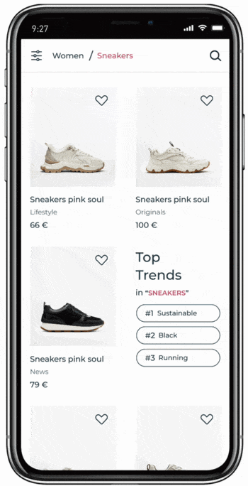
Category pages, also known as product listing pages, are how people browse through a brand’s catalogue to find the product they want. In turn, categories can be filtered by their specific attribute or field of the result (type, colour, brand, size, price, etc.).
When visiting a product category page, we cannot feel, at first glance, any social component. There are no clues about what works for other people, and that feels cold. So, we wanted to explore new ways to humanise our navigation experience.
Experimenting with tech
Findability is the native metric we use at Empathy to measure search relevance success. One of the recent advancements of the metric has been the capability to filter it by product category and measure performance. With this new feature in Empathy Platform, merchandisers and category managers can benchmark search performance at a category level. Overall, it allows the exposure of search and product trends at a category-page level (based on past and ongoing search behaviours, anonymously inferred for statistical purposes). And with our design prototype, shoppers will also enjoy a better Search, one that offers trend information by category.
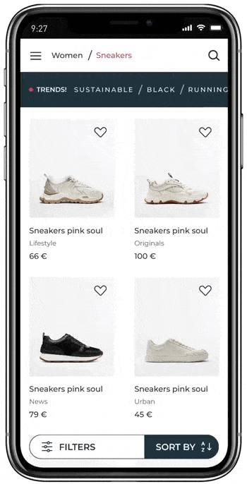
This means when searching sneakers, we can find out which attributes people like the most right now, for example: #sustainable, #black, #running, #barefoot, #comfortable…
Experimenting with sight
Time to answer two key questions: How do we display this value proposition on product listing pages? How do we do this in a way that makes Empathy experiences feel expressive and easy-to-use, without competing with related suggestions or other filters and tags?

The way we add visual emphasis to category pages is through full-width images or images as a product listing. this approach helped us brainstorm and explore different concepts.
We tried using this prototype and came up with the idea of showing it as the winner of a competition. It provided a great playground where we could explore, adding the percentages of each winner to the ranking.
Experimenting with motion
After we had explored all the concepts in a static sense, we thought movement would help us to better illustrate these ideas. We needed to consider the timing and what the action would consist of.
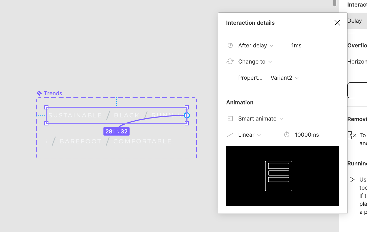
We aimed for a duration of max 10000 milliseconds and a Smart animate + Linear way. The idea was to find the perfect balance between fluent in gaining the feeling of timeliness without being too obtrusive.
After exploring various concepts, we landed on our desired one. Here it is:
Open for Feedback
Look out for this new search trends experience in category pages, to be launched soon in the stores you love. In the meantime, the team and I would love to hear your feedback as we continue refining this experience; do get in touch.