The Hidden Power of Purchase History
The Hidden Power of Purchase History

Privacy Advocate

Growth Designer

Frontend Engineer
Even better than a good experience with customer support is when you don’t need to contact them at all.
Most support requests concern previous purchases, which is why a superfast Search experience for your Purchase History is vital. And, if you process thousands of purchases every minute, you need an efficient system to find that single receipt your customer is calling about. The time it takes to find an order affects the cost of service and overall customer satisfaction.
The best experience, of course, is when the customer doesn’t need to contact customer support at all. Here, a fast and intuitive experience is crucial because when a customer can find the correct information themselves, there’s no need to get support. On top of that, your Purchase History is the perfect start for your next purchase.
There are two ways to use Purchase History as a shopper. One, as an archive of all your previous purchases when you contact customer support or repurchase. The other is to use it as a starting point for your next journey. This works best for purchases that you buy often and contain lots of items, think groceries. Purchase History is a great starting point towards a fast and easy shopping experience.
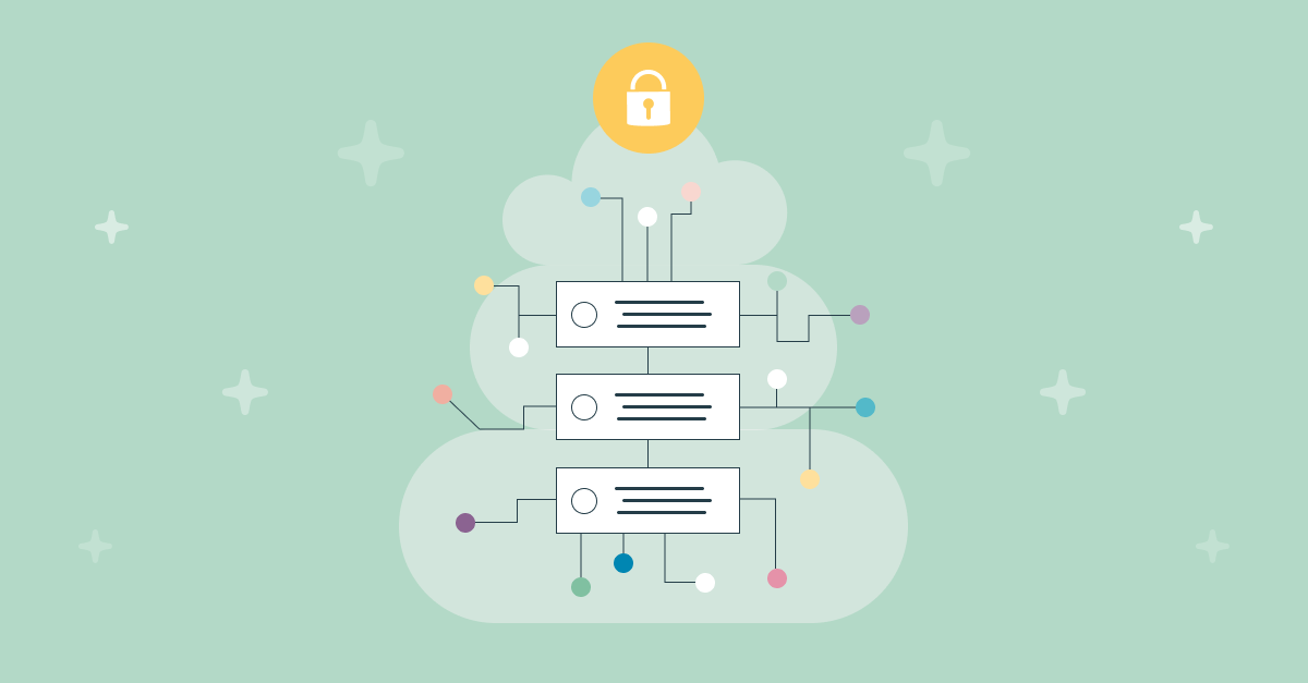
This duality is what brought us to the challenge of creating a single service with two completely different use cases and end-users; and this is how Purchase History was created, with these objectives:
- Near real-time indexing on New purchases
- Flexible data evolution that can be adjusted to changing use cases
- Powerful Search, obviously
- One service for both customers and employees
- Respect customer privacy by using no PII
In addition to creating a super fast and efficient solution for the Purchase History feature, we researched different digital tools with similar functionalities, and we analysed how we could improve the user experience, starting with having clear pain points, which set the course for the design.
Understanding the Pain Points
Customer Support
We detected the fluidity of the data a customer provides during a call didn’t correspond to the position and priority of the filters.
In the tools, the Search did not work correctly at these three levels:
- Global Search among all orders from all users
- Search for a user’s orders
- Search within a user’s order
The position of the filters, in many cases horizontal, made the experience difficult since we would have to stack them and scroll horizontally whilst having a hard time expanding them all at once.
All these points influence the shopper’s mood. Why have an angry shopper if we can fix it by improving a digital experience?
However, from the point of view of a user who wants to access their Purchase History to locate an order or start a new purchase, the pain points around Search are very different. In most cases, we cannot search, filter, or order, so the solution (if we want to locate a previous order) is to do an endless scroll.
Why not take advantage of the Purchase History as a starting point to make personalised suggestions to users in other parts of the experience? Why not promote healthier consumption habits and give users a clear view of which categories they spend the most on?
Within Purchase History, we could:
- Recognise the shopper’s preferences
- Make suggestions or recommendations appropriate to their priorities
- Build confidence and trust in the brand
- Be less invasive in promotions
- Facilitate a dialogue while making a purchase
Designing the Purchase History tool
We wanted to give the user a familiar feeling that reminds them of the usual catalogue search but with the added functionality to give them results quickly and friction-free. At the same time, we knew the importance of not overwhelming the user with all the options and tools at once, so we focused on showing just what the customer needed when they needed it.
Customer Support Solutions
Within customer support experience, we’ve added some innovative functionalities.
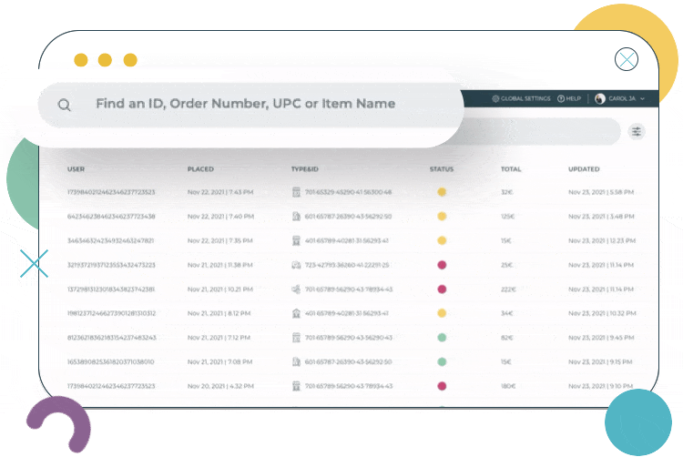
We prioritised the most frequently recurring filters through a tag system within the search bar itself, allowing a more fluid conversation with the customer. The support agent can now go from a global search to a search for a specific order in an intuitive and speedy way, accessing previous searches directly within the search box.
Our next solution was to have a side menu with user information that can fold away if we want to focus on just the search results. Often an improvement in the user experience is caused by small interactions. We aim to include motion rather than static solutions in order to facilitate the flow of navigation.
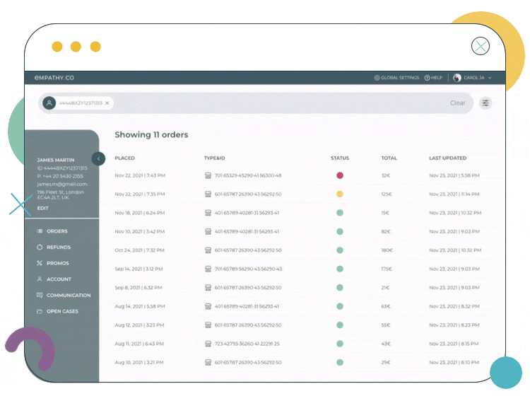
We designed our results tables to be flexible, so they adapt to different devices and we’ve incorporated colour codes to easily recognise the status of the orders. Most consumer calls refer to backorders, so we have to make it easy to identify them.
In addition to the date, status, type, and store filters, we’ve incorporated a price slider that is much more intuitive than a traditional price filter.
Shopper Experience Solutions
We’ve incorporated other functionalities to improve the Search, as the objectives are very different.
The shopper always has access to the filters when scrolling with a floating button, and the search box appears and disappears, detecting the scroll’s direction. The experience is always fluid and intuitive now and, in the price slider filter, we’ve incorporated a histogram so that the shopper can filter the results more quickly.
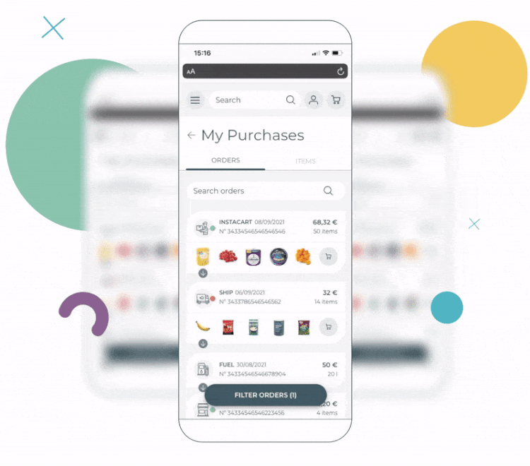
Now, without a screen change, cards display each transaction. Through the scroll, the user can see all their purchases and orders and sort them extremely quickly. With the addition of a fold button at the end of the order, shoppers can collapse a card to follow other orders and small images of the products are shown too. This makes it much easier to locate specific orders.
One of the most exciting functionalities of sorting within the order is the category option. This is a first step towards providing shoppers with information about their personal spending volume and habits. It’s a great way to gain customer trust.
Imagining the future of these tools, these steps are just the start of delivering a new, fully user-driven experience. We hope that each shopper would eventually have power over their data and connect it to the brand only when they want to. In this way, the relationship would remain two-way, with trust on both sides.

Building the Solution
Now let’s jump to the production and development phase.
Once the two use cases were outlined and their differences identified, it was time to start working on the implementation. The API serving both solutions was the same, but that doesn’t mean that both will use all the possibilities of the API. Nor does it mean they will be using them in the same way.
With this scenario in mind, we wanted to take advantage of the similarities between solutions and minimise development time and effort. That’s why the natural approach was to use X Components.
X Components are a highly customisable, reusable and reliable frontend solution, originally designed to deliver search experiences to customers. The Purchase History experience and a catalogue search have many common points, and the customisation possibilities of the X Components can cover the differences. So we decided to use them in this, instead of building from zero.
Shared Behaviours
With the decision to move the filters from a horizontal position to a vertical panel in the customer support scenario, a big part of the experience was shared by both sides. Once it was decided which filters would be available in each case and how the frontend communicates with the API, the pre-built components did the rest.
Next is the list of orders. At first glance, they might not be too similar. In the customer support solution, there’s a lot of information and a ‘straight to the point’ approach. For shoppers, on the other hand, product images and their statuses are used to convey the necessary information. Even with these differences, at heart, they are the same. The information that’s useful to the user is displayed.
X Components already provide a robust option to display the results of a search, so just a little bit of styling was needed to get the application ready. The shopper’s solution still has the expandable result surprise up its sleeve, but that’ll be covered in the next section.
Key Differences
With a good chunk of the development cut in half, thanks to being able to reuse most of the functionalities, we had to tackle the little differences.
The star of the show for the customer support experience is the search box. It shows the information about the specific customer and order that is being searched, so the user can see in a glance the current context of their search. This deviates greatly from the usual functionality of a search box, so a little bit of tweaking internally and a custom component was needed to do the job.
The next big difference is the expandable order from the order list. That’s a feature you don’t usually see in a regular catalogue search, but is much needed to provide all the details of an order in an attractive way. Luckily, we just needed to expand the functionalities of the prebuild component of the search result, as all the information was already available.
The feature was interesting enough to warrant looking a bit more into it too, and its addition to the repertoire of pre-built components is now being considered. This highlights how the Purchase History experience is pushing the boundaries for innovation and how the X Components takes advantage of the applications built with them, feeding back to itself.
Items Search
The items search section deserves its own note as well. It’s a search experience within the purchase history aimed to search for the products the customer already bought. It’s only available for shoppers and has its own endpoint in the API.
It’s big enough to almost be considered a whole separate experience, but thanks to being somewhat closer to a regular catalogue search, the pre-built components let us breeze through the development. The only custom implementation needed was the tabs to allow the change of search content and everything was ready to go.
Conclusion
When presented with the task to create or evolve a product, it’s key to understand how it creates value. Because sometimes, the product you’re working on has more to offer than its initial use case.
With Purchase History, the primary use case around customer support was extended to help customers start their next shopping experience. Understanding the different needs and using our powerful X Components created a flexible solution that can be easily adjusted to specific use cases and evolve when the need for further changes arises.