Six Gestalt Principles applied to UI design
Six Gestalt Principles applied to UI design

Marketing & Design
When developing for e-commerce, we might often wonder about how to correctly distribute the considerable amount of information that we have onto consumers’ screens, such as pictures, names, links, colors or selectors. At first, it may seem like an impossible mission, but this task becomes much easier if we keep Gestalt principles in mind.
Despite the fact that this set of psychological laws was developed in the 1920s, its principles are now more present than ever in holistic web design.
This group of visual perception principles is built on the following theory: \ “The whole is more than the sum of its parts”.
Having this in mind, six key ideas around which Gestalt Principles are built should be taken into account when creating a much friendlier and more enjoyable store for consumers.
PROXIMITY
This key idea establishes that elements arranged close to each other tend to be discerned as a single unit. This principle becomes undeniably compelling when we want consumers to perceive that certain elements are governed by the same rules. For example, when we group the tabs in an interface, users will tend to think that the behavior of each one of them will be the same. However, if we separate them excessively, they may think that these tabs will behave differently.

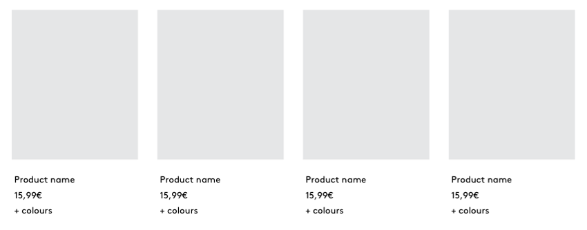
Additionally, the principle of Proximity may help us simplify product display: With the right introduction to product information, consumers will understand the product as a unit, without the need for overdoing the page with a multitude of boxes.
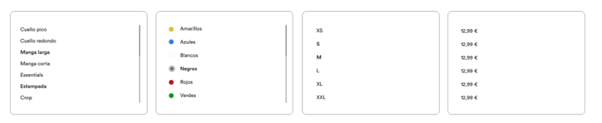
COMMON REGION
Similarly to the Proximity principle, elements placed within the same region are perceived as grouped.
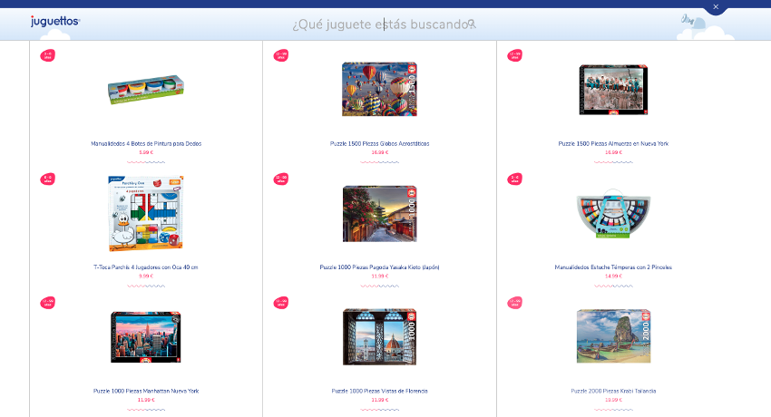
CLOSURE
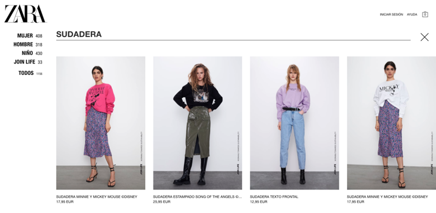
The human eye is prepared to fill in missing information instead of focusing on empty spaces or gaps among shapes. For example, on the Juguettos website, vertical dividing lines are explicit, but the horizontal ones have been shortened to a minimum expression to produce a greater sense of cleanliness. Even so, consumers can still easily perceive the grid on which products are displayed.
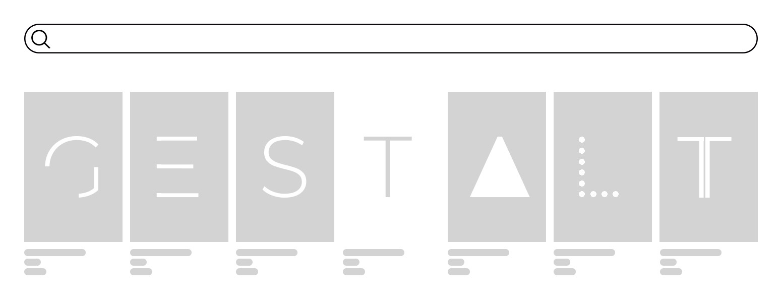
EMERGENCE
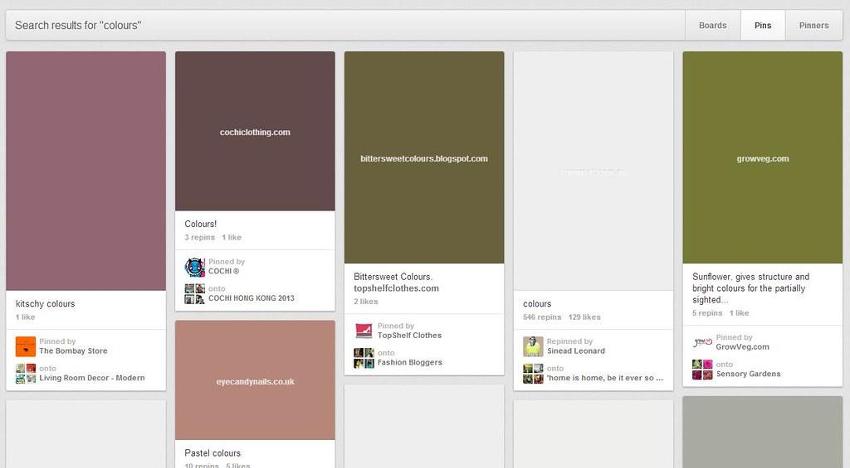
Our eye tends to first identify general elements in their general form and then the well-defined details; this is a reason to use a kind of lazy loading: to prevent the user from waiting in front of an empty screen. Getting indefinite shapes to appear instantly will reassure them that their content will soon emerge. Pinterest, for example, loads rectangles colored with the principal tone of the loading picture.
SIMILARITY
Very useful for icons or other visual elements: When elements share the same styles or similar patterns, the user will perceive them as part of the same family.
SIMPLICITY
Our minds organize perceptual fields better with simple, regular features. The simpler, the better.
As you can see, you don’t need to reinvent the wheel when designing for e-commerce, just take these old rules and think of an innovative way to use them!