Once Upon a Time, in a Land of Data...
Once Upon a Time, in a Land of Data...
Lived a Designer who created brilliant data reports
Since I was little, I’ve been fascinated by mathematics, and I’ve fallen in love with art. And that combination between the sincerity of numbers and the communicative power of artistic expression makes me even more passionate.
Learning from each other by sharing our methods and ideas is an important practice between us designers, and I hope to continue that tradition with you here today.
More and more data is generated every day. Data “hides” so many stories that are extremely difficult to read and comprehend to the untrained eye. This is where the role of a UX Designer becomes so important, giving these stories a visual and contextual life.
By visualising data to tell stories with it, this useful information can influence decision-making.
Years ago, data was simply displayed; nowadays, data it’s interpreted, understood and ENJOYED. But how do we face this challenge as UX Designers?
It’s simple, as designers, we seek to communicate with and positively impact other people. We ensure that the information we translate tells meaningful stories in a way that is easy to digest, and we do this through an empathetic understanding of our target audience and their context.
That’s why I’m sharing a few little tricks with you here…
1. DEFINING THE GOAL
Every tale has a storyline, so we must define ours too. Establishing the most relevant information we want to represent in our report is our first and main challenge. For that, it is essential to identify both who our audience is and what data would be valuable to them.
As consumers, we extract information unconsciously, which is why it is so important as Designers that we minimise the perceived cognitive load on people.
Considering our Audience
When working as Data Visualisers, we Designers must communicate the information in the most accessible way so that it can be understood by all types of people regardless of their technical capabilities. A good summarised report is often a faster, easier and more comfortable read for some, while a more detailed report might be the best option for others. To cover both, we always spare some pages for those who would like to find out more about the story.
Quick tips:
- Form follows function. Work closely with the Data Analytics team to test and select different visualisations to achieve the one that best suits the information and the audience.
- Eliminate the superfluous. Identify and discard any elements that do not add any value. Noise makes our visual elements more complex, so removing this improves the quality of the story and reduces the cognitive load.
2. LET THE ADVENTURE BEGIN
There are two main concepts to consider in any successful design for reports:
A: The Principles of Visual Perception
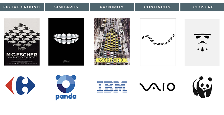
At the beginning of the 20th century, The Gestalt School of Psychology determined the principles of visual perception that define how people interact with the stimuli that surround them and how they order them: Figure-ground, Similarity, Proximity, Common region, Continuity, Closure & Focal point.

These principles help us understand how we see and use information to identify unnecessary elements and facilitate the processing of our visual communications.
B: The Preattentive Attributes
The preattentive attributes (colour, size, position, orientation, shape, thickness, length, etc) unconsciously condition our perception and, therefore, are very powerful tools since our brain processes them quickly (in less than 500 milliseconds) and with hardly any effort.

These attributes are important because they help us focus and guide our attention onto what is relevant in these visualisations.
3. WRITING THE STORY
Once we have a clear goal and a good foundation, it is time to make that report tell the best story ever written. Study these tips very closely; they will come in really handy.
Attention
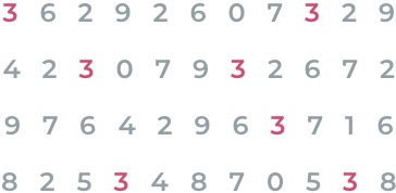
Direct your audience’s attention to where it should be focusing on: in other words, highlight what is important.

Visual Hierarchy
Create a visual hierarchy of information that guides your audience through the information you want to communicate and how you want it to be processed.
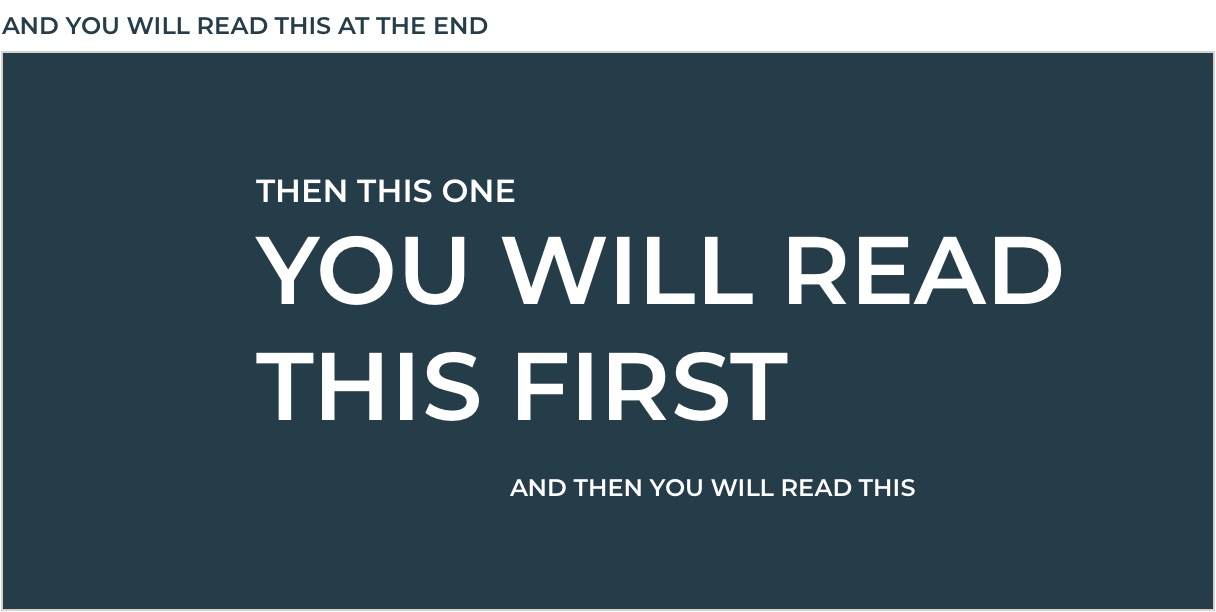
Visual hierarchy helps us avoid chaos through resources such as:
Alignment
Keep your report designs precise, clean, and uncluttered. Always prioritise left alignment as, in the absence of other visual cues, this is how our brains will begin to read. And avoid text rotations a much as possible; they slow down the reading.

Horror Vacui
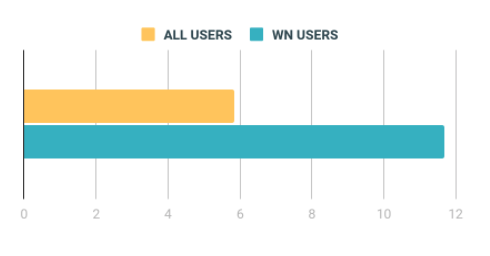
Don’t be afraid of white space. White space is not our enemy. It helps us focus and highlight what is truly important. A deep pause always makes a story more interesting.
Contrast
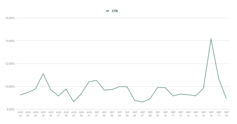
Use Contrast to help readers focus their attention, avoiding visual chaos. If there is something really important to show our audience, we must make it stand out from the rest.

Texture
Make use of different textures (lines, dots, etc.) to represent different types of content.

Colour
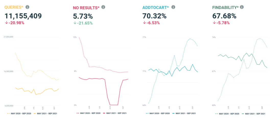
Use colour consistently to represent values, either following standards (positive-green, negative-red) or brand guidelines.

Keep it simple
Remember that less is more and that our main goal is to transmit valuable information in a joyful and understandable way with very little effort. You can do this by:
- Decreasing the impact of data lines to avoid reading interference
- Eliminating repetitive data
- Simplifying labels using abbreviations wherever possible so that texts can fit horizontally
- Keeping the legend close to the graph to facilitate its interpretation.
4. THE END IS NEAR
But wait, “There is no real ending. It’s just the place where you stop the story.”, said Frank Herbert. And it is true, as Designers, we are aware that our work can always be improved, and iterations are part of our every day. This is the good thing about writing, designing, and learning; the more you practice, the better you become.
Review your report, share it with your team, even with your target audience, gather feedback, improve it and keep growing.
CONCLUSION
I love being able to give visibility to the relationship between these two worlds of logic and art and, thanks to new technologies and the challenges we present ourselves with, I get to do this a lot.
We have the great ability to gather millions of pieces of information a day. Our objective as Designers is to help our audience trust it, interpret it, and enjoy it with a minimum of effort.
An even bigger challenge arises here, the opportunity to convert all this information into strong foundations and research goals to improve customers’ experiences.
But that is another story, for another time…

