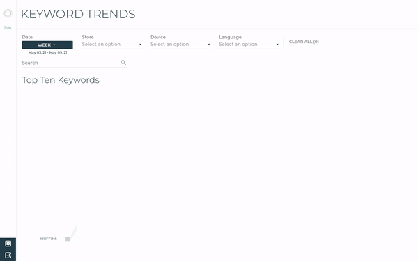
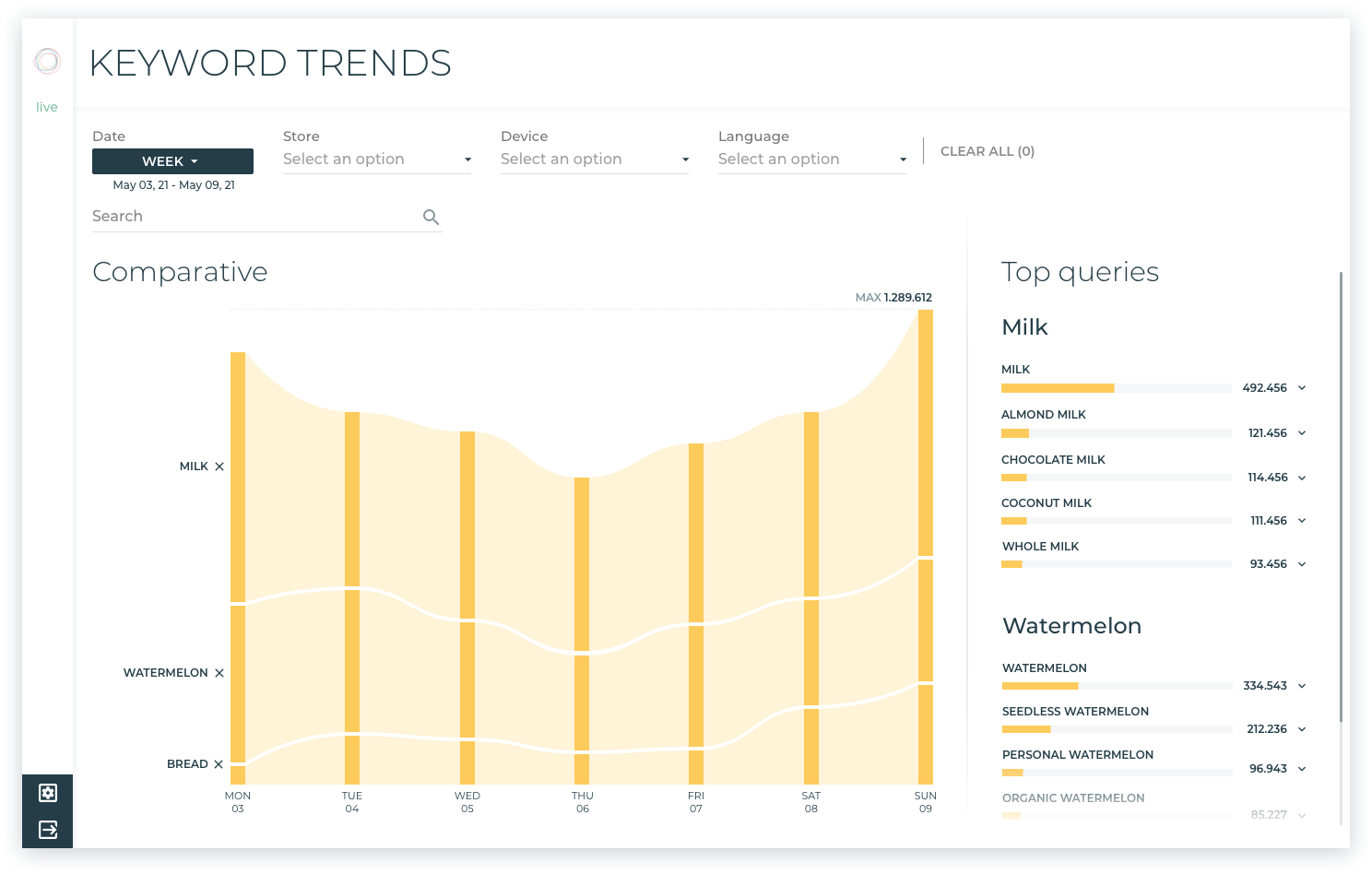
Keyword Trends
Keyword Trends
Follow the yellow brick road of data visualisation

UX/UI Designer for Playboard
Data visualisation (datavis) is like Dorothy’s yellow brick road full of emotions and discoveries — an opportunity to uncover even more than what you were looking for. It’s an exciting journey bringing the hidden to light.
To help merchandisers better understand shoppers’ interests and what they search, the Play team and I created our new Keyword Trends datavis in Empathy Playboard. Commerce marketers and analysts can easily choose a yellow brick road (customer queries) and explore which keywords are the most important and how this evolves over time for a particular search.
Back to The Wizard of Oz. Remember what those quirky characters are searching for? Lion wants courage; Tin Man wants a heart; Scarecrow wants a brain.
Connecting this to Keyword Trends, I think of our courage as transparency in the datavis, clearly communicating data to marketers using Playboard while protecting customers’ privacy. For the heart, we wanted this datavis to be beautiful visually, as well as joyful and easy to navigate. And as for the brain, we want to truly learn through data, to invite surprising insights and encourage reflection.
SOMEWHERE, OVER THE DATAVIS
While Dorothy searched somewhere over the rainbow, we’ve turned to psychology for inspiration. The Play team and I went down our own yellow brick road of many ideas, demos and experiments to get to the final visualisation.

We considered the most important Gestalt principles for designing this datavis: continuity, proximity, closure, similarity and prägnanz (good figure). Adding different visual variables — such as shape, position, size, hue, opacity and textures — we communicate the stories this datavis tells whilst grabbing the audience’s attention.
Thanks to these design decisions, merchandisers using Playboard can quickly differentiate, process and retain the data they see. Our approach to designing with organic shapes enriches the connection you get from this datavis, making it more analyst-friendly.
In addition, we’ve made marketers’ lives easier by utilising Hick’s law. We separated complex tasks into smaller steps and clearly highlighted the next steps for exploring the datavis, placing key information at the top of the Playboard and distributing the rest of the elements in order of hierarchy. By simplifying the number of stimuli present, we reduce the marketer’s effort in the decision-making process.
QUERIES & FILTERS & FLOW — OH MY!
Though we didn’t face any lions, tigers or bears, we did face the tough task of visualising complex layers of information to tell the complete story behind keyword trends.
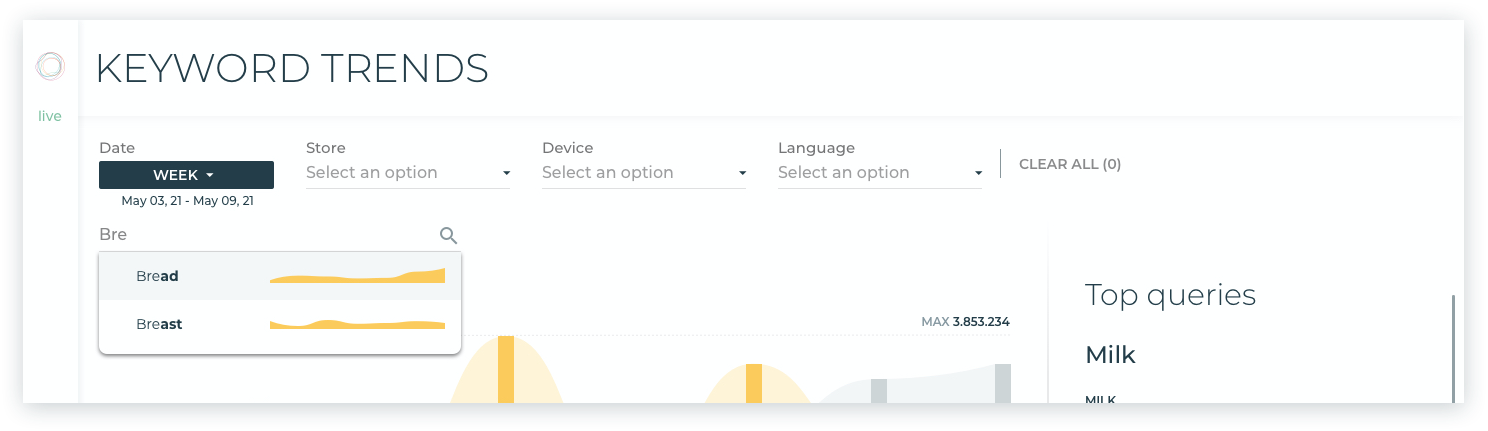
First the top ten Keywords flow across the datavis, sorted hierarchically by query volume over time selected. From here you can filter by a wide range of search preferences: date, store, and language, or search for a specific keyword.
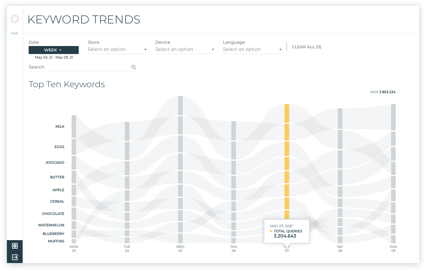
Exploring the flow, you can discover different types of information: individual or global values, such as the number of queries per day or the daily queries for specific Keywords.
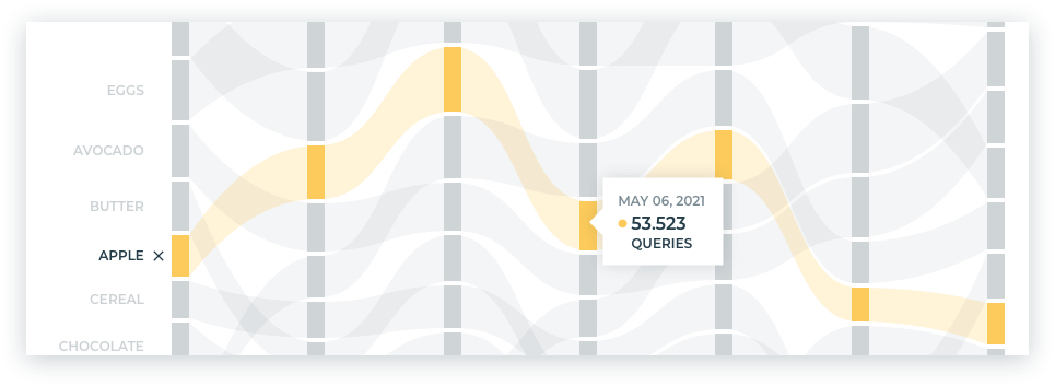
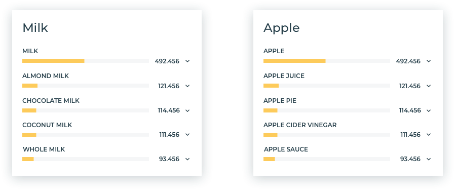
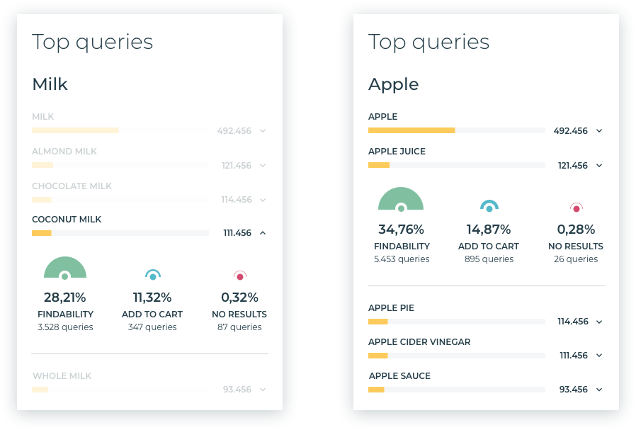
For even more detail, you can pick a yellow brick road and find the top five queries related to that selected Keyword (shown on the right of the datavis).
Clicking on a query shows you the most important KPIs, such as Findability, Add to cart and No results.
Finally, you can also compare keywords and their queries.
THERE’S NO PLACE LIKE PLAYBOARD
Through our journey in creating this visualisation, we’ve created a powerful tool to discover real-time feedback about what people are really searching for. Merchandisers using Playboard can dig deeper into both the best and worst moments of a product’s life, gaining insights to improve overall catalogue performance.
And just as the Oz characters, we’ve united our passion, knowledge and courage to create a memorable experience.
Dive in for yourself, and tell us what you think!