Introducing the ‘all-in-one’ Search Performance Visualisation
Introducing the ‘all-in-one’ Search Performance Visualisation

COO
In our last post, we saw how the Daily Dist Report is one of the most frequently used reports. It displays multiple information on search data and KPIs, so it’s perhaps not surprising that it’s one of the most popular reports on the Empathy Stats API. We looked previously at the different ways it can be applied, such as from a location perspective, to visualise search KPIs distributed by country and continent. This offers a full understanding and detailed analysis of any eCommerce’s Worldwide Performance.
In this post, we’ll continue to explore the Daily Dist Report and another useful visualisation; Search Performance. One of the key, and incredibly useful, features of this visualisation is the way it easily highlights and draws comparisons between behaviour and performance across various devices.

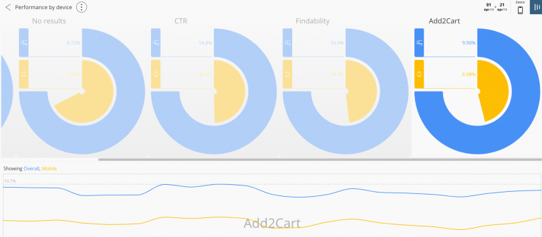
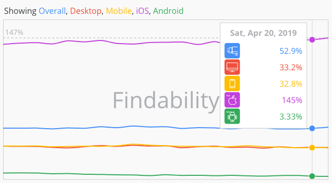
By having an overview of search KPIs, you can easily view the most important search performance behaviours from the number of queries, findability, CTR, No Results, and add to cart rate. All organised by device.
The visualisation also provides the option to assess each indicator individually and monitor performance using specific filters.
Visual figures from a “by device” perspective
Each KPI is arranged to display individual performance rates by device. The display has been designed to make it as easy as possible to identify any gaps or outliers in global performance by filtering the indicators by device. As well as offering a global perspective, there is the option to drill down to check each point of analysis from a single device perspective, as well as being able to compare performance between multiple devices.
Time Adjustability
Global figures for any selected time period can be shown using the relevant filters. Alongside these are filters for language and store/ location. For a more detailed view, at the bottom of the screen, KPI figures can be viewed by day.
Great business value
- The Search Performance visualisation offers a complete overview of site search performance by observing five main KPIs simultaneously.
- It individually tracks performance per device, comparing KPI behaviour across multiple devices.
- It shows which devices are performing better, helping you to identify gaps or issues and where improvements can be made.
- It allows you to analyse each KPI’s behaviour over specific periods of time or days.
Search data visualisations, through making eCommerce search data more visible, more understandable, and more actionable, allow retailers to be more strategic and build more inspired and lovable search experiences. Enabling them to spot performance issues, deliver improvements, and drive the best business results through the search box.
If you want to learn more about search data, its performance and the actionable insights it can provide to your organisation, download the Search Performance Visualisation overview.