Empathyzing data visualisation
Empathyzing data visualisation

UX Engineer
At Empathy we love everything that generates dynamism and that’s usable. So one of our favorite entertainment spots is imagineyourdata.com, a space where we comment on and expose everything about data visualisations: We test the new ones, we comment on trends, we show real cases and much more! In the end, we do what we really like: You know… We love data!
But this little corner of the WWW was asking for a little bit of painting, so we decided to give it a slightly new look and empathyize it even more!
Logo

To start thinking on the logo, we adopt three concepts as our pillars to build our Brand imagery: data, visualisations and open source.
The idea is to conceptualize everything and translate it into an icon that has its own identity. In this case we choose the letter “D” and we work those three concepts into it. In the end, the result is a minimalist style without artifice; we show what we are and what motivates us! We apply our Empathy style, and as a result we get a cleaner and clearer look. “Less is more” and here we try to follow this idea.
Colour palette

We tend to contrast, playing with organic lines and blocks of color that generate a unique style comprising greens, grays and of course cleanliness: This is what we achieve when playing with neutral backgrounds.
Its main use is oriented to communication in networks where we can position our brand and create a faithful list of followers. We are not lacking in energy and desire to achieve it :-). Our great authors and their wonderful work take care of the rest!
Web
Before giving it a new coat of paint, a series of considerations were established, among others:
- We needed a grid similar to an existing one, but that had a new appearance.
- We would structure the content in a more dynamic way.
- We would respect the corporate brand line.
- We would maintain a clean layout in the posts.
The feed, first look!
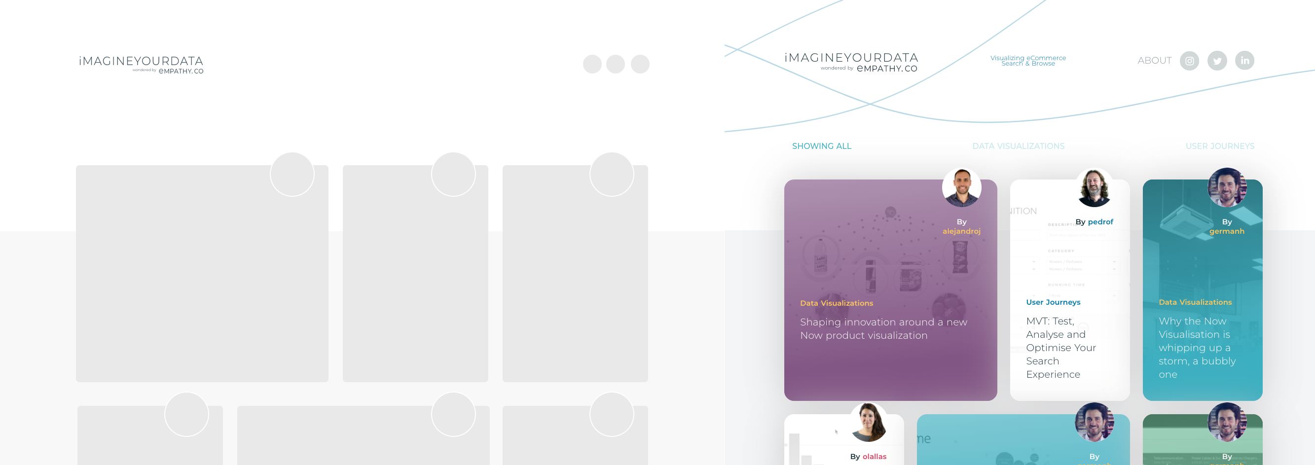
If there is one thing that stands out greatly from this meeting place, it is the home page, where the user can see the latest publications through a colorful feed. The challenge in this case was to transfer all of the above to a new, more fluid and compact skin, giving prominence to those visualisations in a smoother way and playing with our rich corporate color palette.
In this way, we managed to preserve the soul of the blog, but give it more lightness through blocks as entries progress. For this we also decided to change the entry thumbnail images according to our new way of displaying this page. Our new authors take on greater prominence by giving them a preferred place in each block because, in the end, without them none of this would be possible.
Other news
Another of the ideas that came to us was to divide the posts into two different categories: User journeys and Data visualisations. The first one is focused on everything that is not strictly carried out with data visualisations, while the second one shows only different types / styles of them.
To further identify the categories, it was decided to paint the former on a neutral background, and the latter on a colored background (choosing different shades through the Empathy palette). In addition, two search filters were added to the top of the feed. The result is a categorized navigation from the first moment.
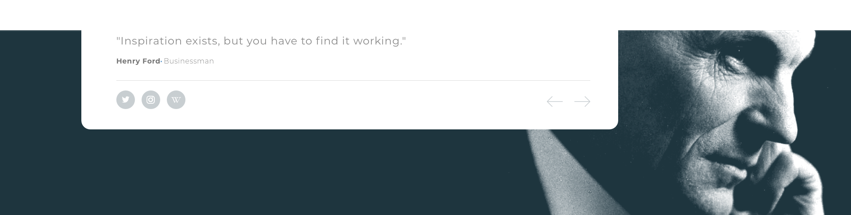
As it could not be less, we give a corner of thought to all those geniuses who have shown us the way to follow and who are a constant inspirational source in our lives. That is why we decided to brighten up the vision of their famous phrases through a dynamic footer, choosing portraits and applying blocks of color to each one for a more impressive result. This is ultimately about giving them visibility – and no, do not ask us to choose only one footer, we cannot!
We have a great surprise in the oven, but for now we can only invite you to follow us so that you are always aware of what is happening in the caves of wisdom!