Brutalist websites: Going out of our comfort zone
Brutalist websites: Going out of our comfort zone

Graphic Designer
During the last few years, we started seeing webpages that reminded us of the first websites from the 80s and 90s, being either full of text with no photos or having “too many” gif animations and hover effects.
At first, these were just a few pages from a few edgy design agencies or designers and my initial reaction was, “hmmm, it’s ugly but I like it, yet I don’t know why”.
Nowadays, this type of “Brutalist” design has become a trend and one not only considered as something underground or punk, but as common and mainstream in design fields.
Origins of brutalist web design
It all starts with Google’s material design commandments and the product design hegemony of Apple. Google makes all the rules regarding usability, colours, icons and gradients while Apple’s always been in the lead on product design.
If you’re not as big as Google or Apple but you follow their standardisation rules and copy their style then your design (if you’re a designer) or the web design of your company (if you’re an entrepreneur) is going to work. It’s going to look ok, it’s going to be functional and the user is not going to feel frustrated when he visits your webpage. No one will be able to say anything fundamentally bad about its design.
The problem here is when you enter design websites such as Behance or Dribble, for example, everything just becomes too similar. Despite these websites publishing work by some of the best designers, when you take a global view looking at all the designs, everything blends and nothing stands out, sometimes you feel bored to death.
This is why the Brutalist design movement came to life around 2010, its name is taken from the Brutalist architecture from the 1950s. In 2014, Pascal Deville started to collect these designs while defining Brutalism as a “ruggedness and lack of concern to look comfortable or easy” as a “reaction by a younger generation to the lightness, optimism, and frivolity of today’s Web design.”
With this webpage, Brutalism started to be more standardised and, despite the main rule being that there are no rules, all of these designs have a retro and raw style that takes the user out of their comfort zone.
Brutalist Trends
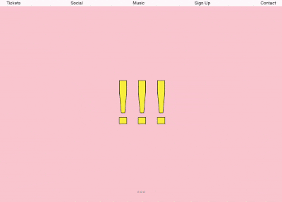
I’d differentiate two distinct trends within brutalism: the ultra-minimalist one where the code seems handmade, there are no flourishes or images unless it’s totally necessary.
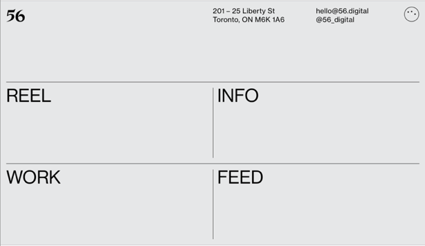
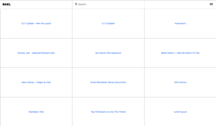
Personally, I love this style. Firstly, because I’m a retro nostalgic and secondly, and most importantly, because although it doesn’t stand out aesthetically with transitions, colours or parallax effects, I think it has a very honest design and it goes straight to the matter.
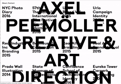
The second trend is not as minimal, it’s more “punk” and its focus is to ignore all the “best practices” and a user-centric navigation.
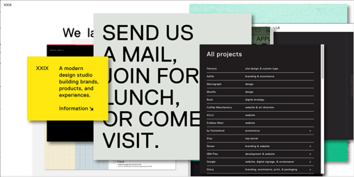
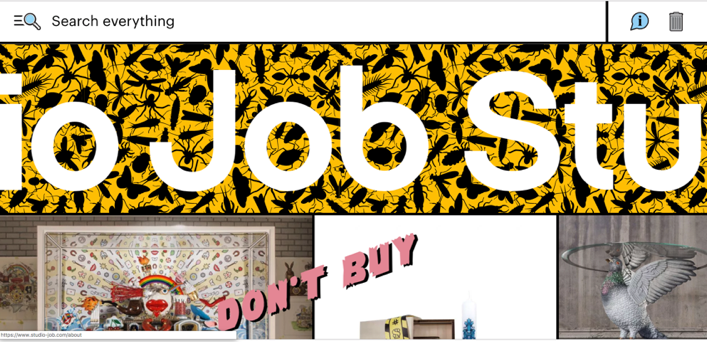
These type of designs are more powerful in terms of the aesthetic impact but they’re also more dangerous as, if not used properly, we can take the user too far away from their comfort zone. This could mean that once the fun of first visits ends they may well get tired of this type of contra-intuitive interface.
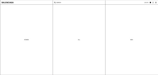
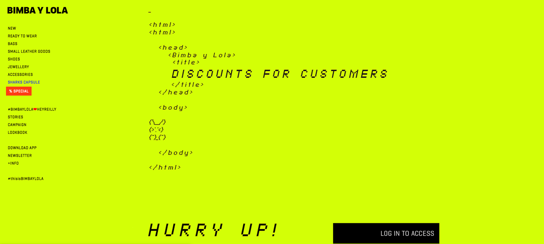
So, how is it possible that something that doesn’t prioritise usability has gone from being something edgy to something mainstream where eCommerce companies like Balenciaga or Bimba y Lola have already taken the risk to adopt this style? Does it mean that everything we’ve learnt about design is a lie? Do we now need to make dysfunctional designs to stand out?
No, it’s not just about breaking all the rules. Firstly, you must know your client and their users. The Brutalist design doesn’t work or fit well if the client is not transgressive or doesn’t like to take risks. If your client is a gen-z clothes shop then go Brutalist. But, if your client’s a wedding dress shop then you should think twice before making this type of design. It stems down to knowing your audience.
Secondly, it’s important to know all the design rules to understand which ones you can break. Especially when using the punk trend within Brutalism. The key is to find the peak point where you can give the user enough stimuli to perceive the interface as something playable and fun but without having to flaunt it or overdo it.
Plus of course, if the site loads faster because you don’t have any CSS or any extra images it also helps improve the user experience. The trick is to use the design to be able to establish an emotional connection with the user beyond the usability.
And the most important thing is that this type of design not only takes the user out of his comfort zone but also the designer who is forced to be more creative to think up other ways of navigation or interaction.
If you’d like to know more about brutalism, there’s a brutalist framework explained with a humoristic tone here: https://www.uxbrutalism.com/ and here and here you can find lots of real life examples.