Visual Facets: The Forefront of Search and Discovery
Visual Facets: The Forefront of Search and Discovery
Faceted search is a vital search and discovery feature for certain e-commerce sites that have a huge catalogue and several product categories. It relies on sets of terms structured by relation; users mix and match different options (price, colour, category, and more) to progressively narrow down the search results list until they receive a proper selection of relevant results.
Until now, the way to do this filtering has been through standard HTML controls, such as checkboxes, lists of terms, and drop-down menus, that – if not properly designed – lead to cumbersome interfaces and underwhelming user experiences.
Nowadays, visual content dominates the e-commerce scene, and all the new trends in search and discovery go through textless experiences, similar to the native apps to which users are accustomed in daily use. Given that most of searches come from mobile phones, driving more visual - and human - user experiences becomes critical for websites.
It seems that filters and facets are still a pending subject for many e-commerce sites when trying to deliver a more frictionless, dynamic and delightful experience. However, great examples of visual search are inspiring sites to act, and we are certain that many more examples are yet to come.
PLAYING WITH THE CATALOGUE
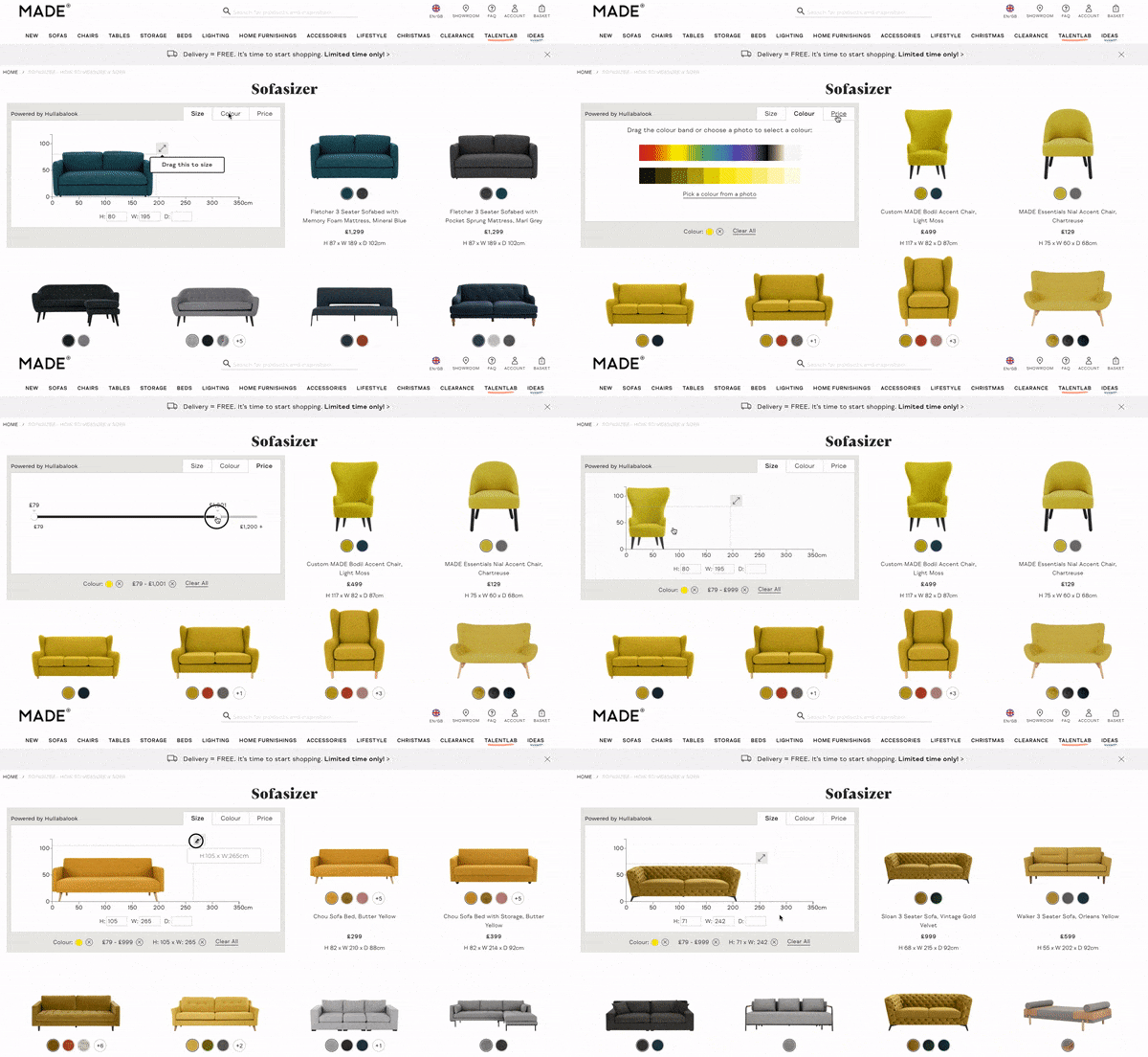
Made.com recently integrated a product discovery solution for finding the perfect sofa. The Sofasizer offers the most suitable products at the top of the page according to user interactions, with a compact widget to easily combine a desired colour, price range, and - the most important factor when looking for furniture - the size.

In this way, a shopper does not miss any catalogue product that fits their available space, and, at the same time, the website guarantees an enjoyable discovery time.
DESCRIBING THE PRODUCTS AND CATEGORIES
Depending on the kind of business and website, visual facets can completely change the way a user finds the right products. Here are some examples of visual facets that quicken the search and discovery process and capture the user’s intention.

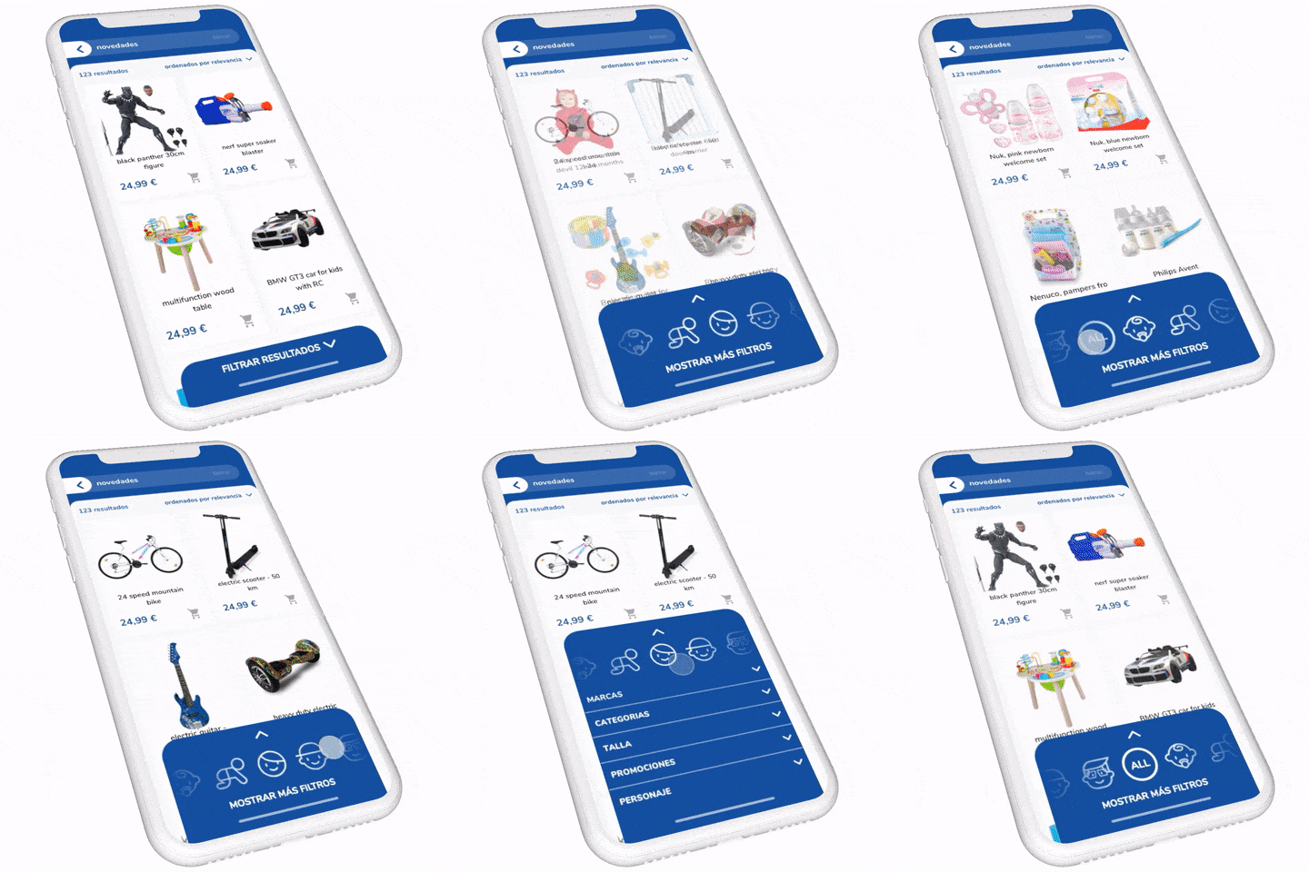
In a toy store, the main filter to narrow down a catalogue is the age group. Using a draggable control at the bottom, combined with instant feedback of the products matching the selection, creates a good starting point to interact. If the user needs to filter for more specific items, it’s easy to expand the filter area to access all the available options.
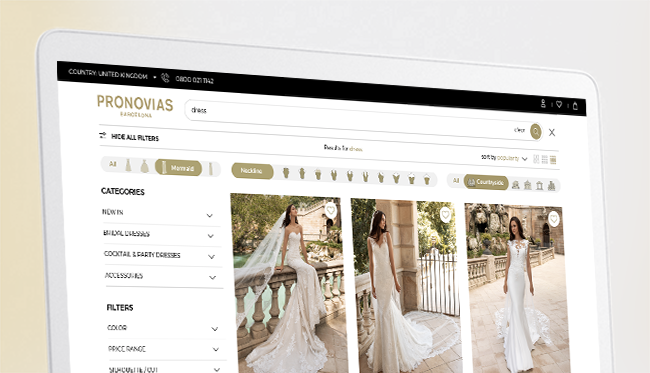
At the moment, we are working closely with some clients such as Pronovias on Visual Facets that are adapted to the search requirements of such important products as a wedding dress. The desired silhouette, the neck type and even the kind of celebration can be selectable on a facets menu to find the dream bridal dress.

As Made.com and Pronovias are discovering, Visual Facets are an alluring new forefront of UX that reaches customers’ hearts and makes the difference in search and discovery. By creating customizable, simple and smart solutions for visual faceting, your users will be accompanied by the best of the shopping assistants and will interact with your catalogue as quickly and easily as possible.


