UX for Search & Discovery: Different Approaches by Industry
UX for Search & Discovery: Different Approaches by Industry
As online shopping matures, Search & Discovery has become the center of the customer experience. But how did that happen? Quite simply, search and discovery connected products and consumers, to produce a real conversation between shopper and catalogue. From a UX perspective, there are huge differences in the objectives of each experience, depending on the sector and the target customers.
In fact, the user journey is quite different depending on the kind of product or service the customers are searching for. And in each step of the journey, these differences – and how one tackles them – are the key factors to successfully solve a complex scenario.
We will focus on these differences through three vertical sectors – there are many more – that will showcase some of the different scenarios and how they can support each stakeholder’s goals. These sectors or commerce industries are: Health & Beauty, Fashion, and Groceries.
First Impressions
When the customer visits a site for the first time, the UX focus is to provide a clear presentation of the potential objectives – and this is where the search box placement can first assist shoppers. Depending on the site, and the vertical, the search box requires greater or lesser visibility depending on business needs and market trends.
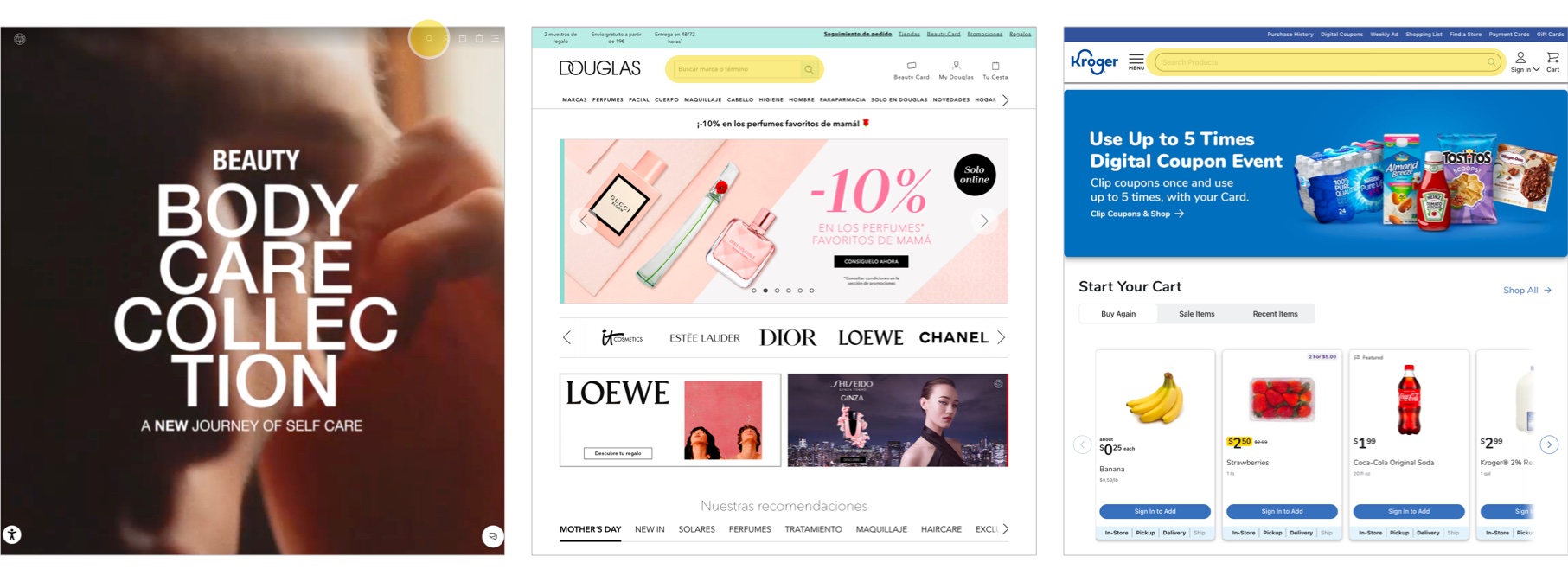
Once the customer goes through the search box, the search interface and the suggestions layer are deployed in different ways depending on the main goal of each business.
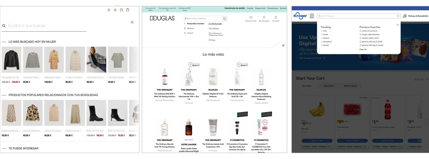
For health and beauty products, the Douglas UX guides customers with a set of suggestions so that the search can anticipate their needs and show top search terms and top clicked products at the first instance, before the shopper types any query. This experience differs from fashion commerce, in which Massimo Dutti customers find a set of different product suggestions in a very visual and expandable presentation.
Compare that to Kroger: When selling groceries, it is necessary to be more precise in terms of search suggestions and to guide the consumer as much as possible, not only through the most-searched items, but also through previous searches, especially for those recurring purchases.
Browsing
Although the initial user experience was similar in terms of layout, customizations to subsequent browsing experience must relate to the ways in which the customer can filter or reorder the results and how product cards are made more or less noticeable.
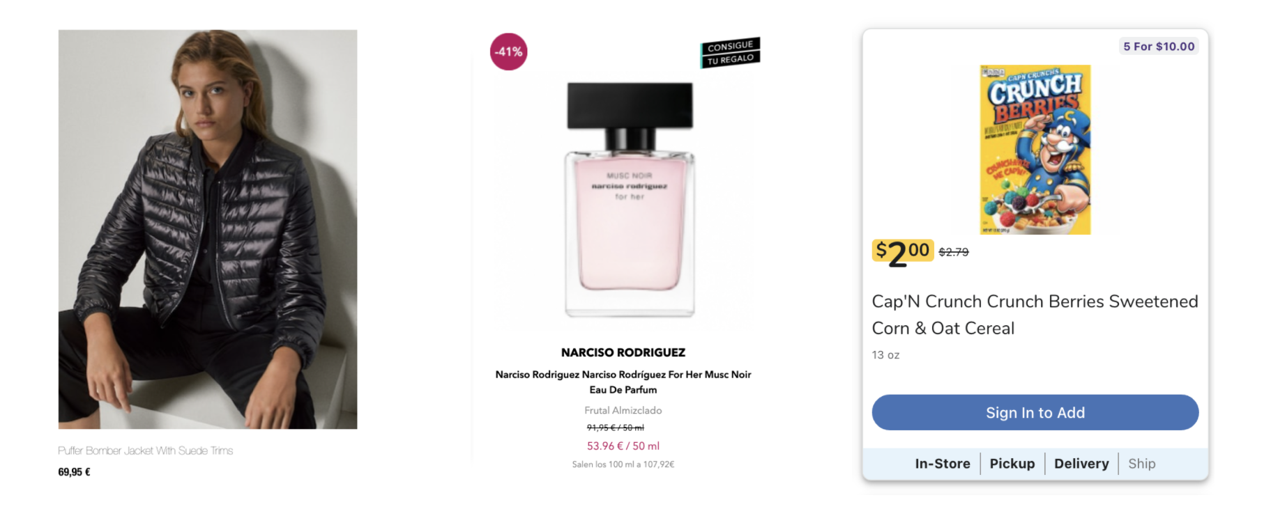
The fashion market is more focused on large and stylish images to connect with the customer, but the grocery market is more focused on isolated, balanced and neutral images accompanied by all the relevant information to help consumers to take an informed opinion about what they are seeing. And the health and beauty business (represented by Douglas in these examples) lies in between, with a combination of large images – particularly for luxury items such as perfumes – and, at the same time, very informative and functional displays.
As part of the browsing process, the customers need a way to filter and narrow down the volume of results that may appear, especially considering the large catalogues that those industries manage. All the filters, as a starting point, will include the different product categories that will be also customised depending on the market and catalog to show.
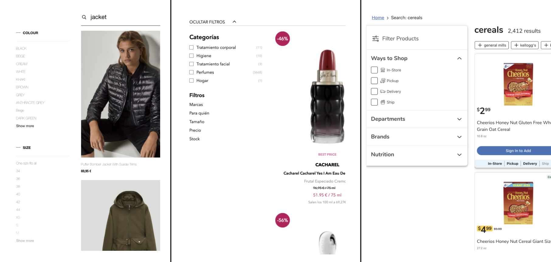
Consumers can find different particularities in each industry. In grocery shopping, customers can filter by the kind of delivery, avoiding frustration in terms of product availability depending on the location and means of pickup or delivery. On beauty sites, the key filters are price or category, and on fashion sites the key filters correspond to the size and colour.
The filter column may look the same in all of them, but the way the consumer interacts with the results differs from one industry to another, as consumers’ needs are completely different.
Search & Discovery Iterations
Below the surface, there are many other iterations within the customer journey. These are subtle helpers in the search experience and easily customizable layouts depending on business or brand. But all these tools have rationales from the UX perspective and according to the industry or sector to which they are dedicated.
Redirections
The search box is always anticipating what’s the best match from the customer’s query. When customers type certain keywords, it redirects them to specific or custom pages to offer a clear and actionable solution for that kind of query and customer need. That’s why these redirections, among many more predefined situations, may happen:
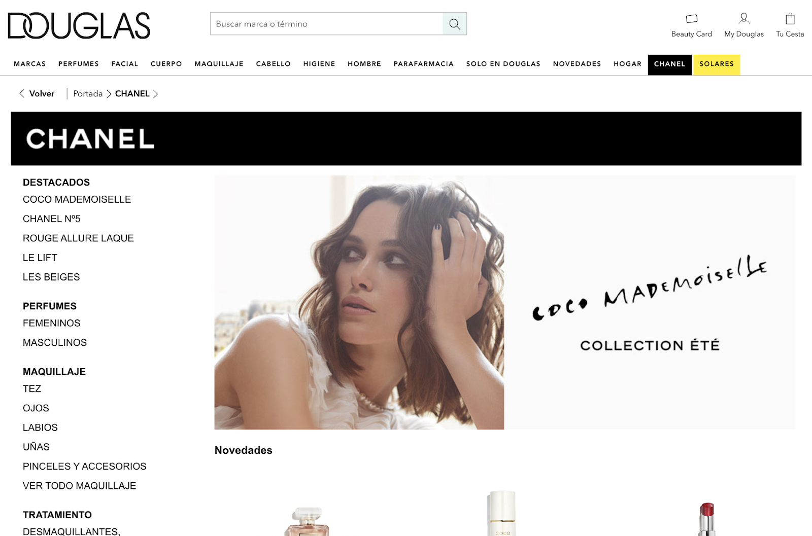
- A custom page for a luxury or very important brand on a beauty site. When the query “Chanel” is typed at Douglas.es, the search redirects to a page with all the products under the desired brand. Here the brand acts as a category with a wide and diverse product offering.
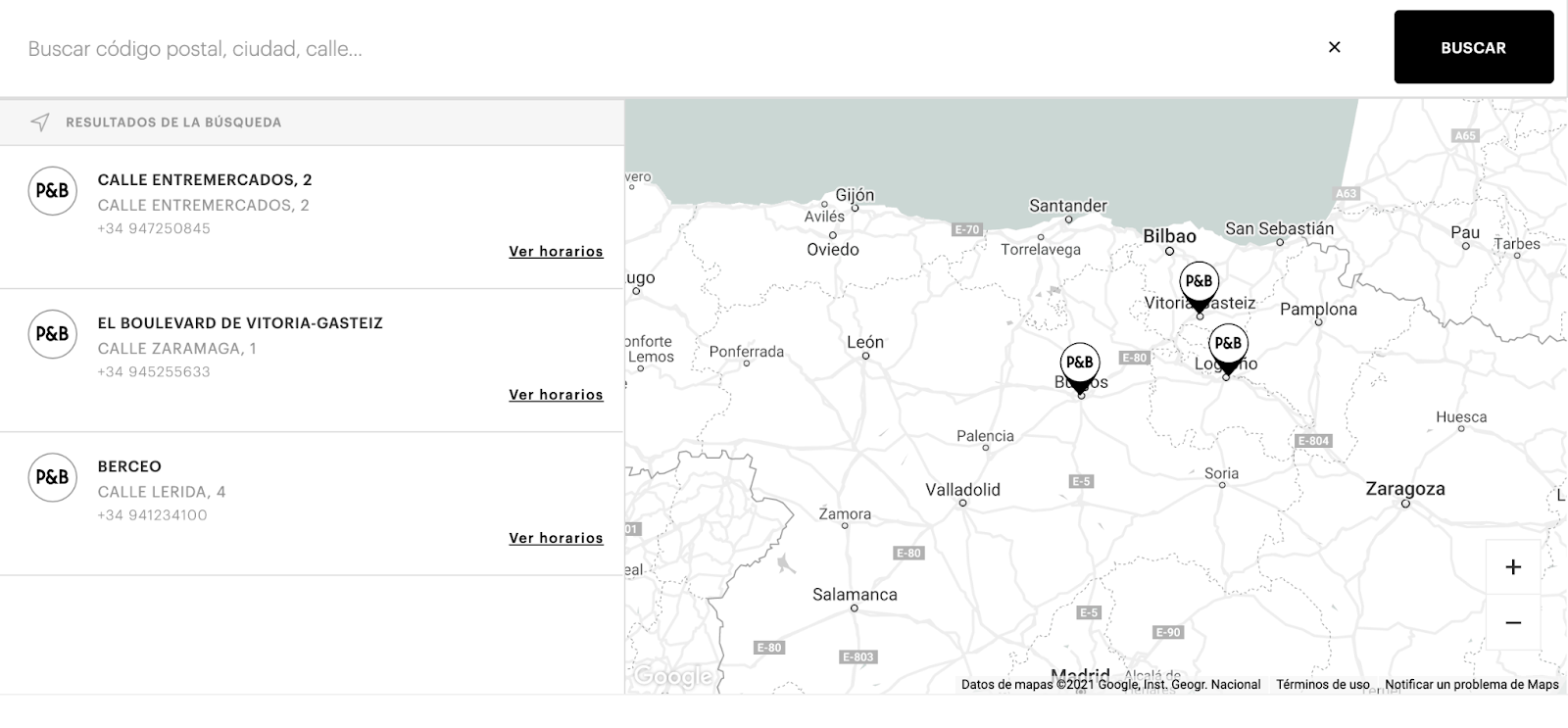
- A page for general information. If consumers search for locations on a fashion site or a keyword such as “shops”, the redirection will drive the customer to the shop locations page so that they can find the nearest one.
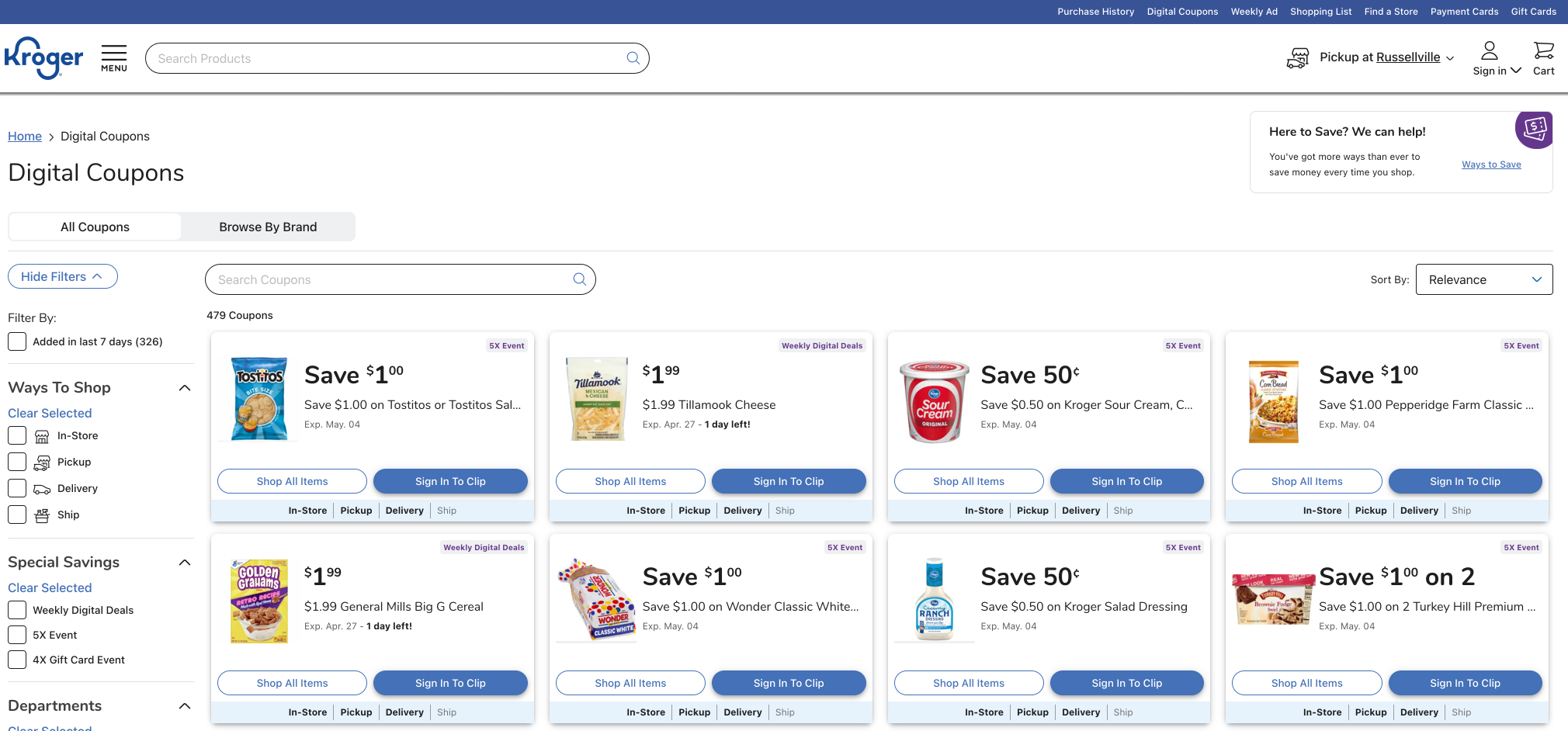
- A custom page for product information or discounts. When talking about online supermarkets, these kinds of redirections are very useful when a shopper is looking for promotions. If consumers search for “coupons” at Kroger.com, a set of results with the different available promos will be displayed.
No Results
For certain scenarios where no-results pages must be shown, the main goal is always to encourage shoppers to continue with their search experience and to discover surprising value in the e-shop catalogue. These no-results pages may differ from one market to another.
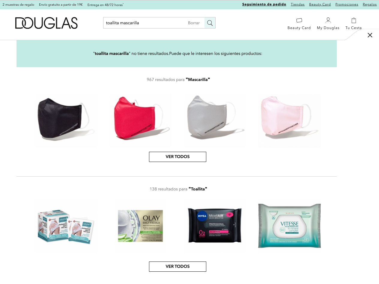
On a grocery site, for example, it will provide shortcuts to different areas of the site that drive the customer through next steps to continue shopping or complete the cart. However, Fashion and Beauty will try to keep the attention of the consumer on alternative and trending products.
When dealing with long or complex queries, you may find No Results. Depending on the type of business and catalogue, partial results may be returned instead, corresponding to terms close to those of the search.
Related Products
There several touchpoints where related products will be shown to the customer, and their look and feel will also be different depending on the previous interaction. These kinds of suggestions are shown to customers when they have not found what they were looking for or when they are just discovering the catalogue, for example after a long scroll on the results page with no clicking.
On sites that use a more visual approach to sell their products, like beauty or fashion, the quality of the images is key to grab attention from the customers. In that respect, based on behavioural pattern and previous searches, some product suggestions are shown to the customer based on what other customers have done after the same search. Product pictures are the prominent element to drive attention here. If the shopper just searched for “jackets”, for example, they might be offered scarves next. Empathy calls these predictions Next Queries.
As the number of items on display are higher, online supermarkets rely on using tags instead of images for those Next Queries, so the search focuses on the query typed and not so much on the product itself.
Takeaways
Search & Discovery must be adapted to the kind of business and industry. All these mechanisms to facilitate the search and promote discovery are tailored to each business audience and also customised to each brand’s requirements and catalogue expectations.
Thus, you smoothly guide your customers through the search experience and you allow them to surface the catalogue with no friction, and, what’s more important, make the most of each industry’s products and offerings.
In future posts, we will cover micro-interactions occurring through the search experience and the different ways to approach them.
Contact us to learn more about how to adapt your business needs to your Search & Discovery experience.

