Using Real-Life Pictures Into Data Visualisations
Using Real-Life Pictures Into Data Visualisations
The world of data visualisations has been evolving heavily during the last years. We have reached a point where it is so difficult to find a unique angle that hasn’t been treated yet.
That said, there is still a chunk within visualisations design that has not been so exploited. That is the incursion of pictures and real-life images into data visualisations. Of course, everything depends on the kind of data we want to expose and the audience to reach out but there is always a good reason for considering the possibility of using real images to make a visualisation more expressive and emotional.
MAKE A VISUALISATION DESIGN MORE ATTRACTIVE
With real shapes and images, a visualisation can be more accessible, get more attention and even become a way of art.
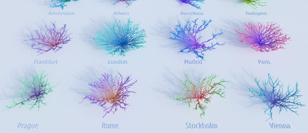
This is what Craig Taylor, Data Visualisation Design Manager at Ito World, reached with Coral Cities. This beauty-centred visualisation maps out how far you can travel by car from various city centres in just 30 minutes, ignoring traffic. This ever-evolving visualisation has become art and the creator plans to put bespoke prints on sale soon.
EXPRESS THE INSIGHTS BETTER
This is the great challenge of using real-world images into Infographics. For instance, it’s one thing to see a line graph for the evolution of syringe exchange across years and it’s quite another to see this line graph shown as a rope held by men with different levels.
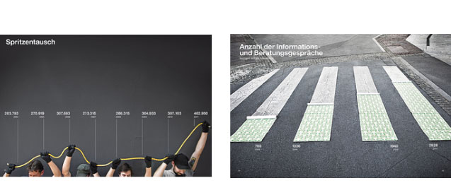
Artist and designer Marion Luttenberger uses real-life images as the basis of her infographics, being able to craft an entire annual report for an organisation that provides aid to drug addicts in Austria -and still communicate the organisation’s mission clearly and effectively.
Photography-inspired visualisations like these are a great way to convey a message and make an impact with real data.
STORY TELLING VISUALISATION
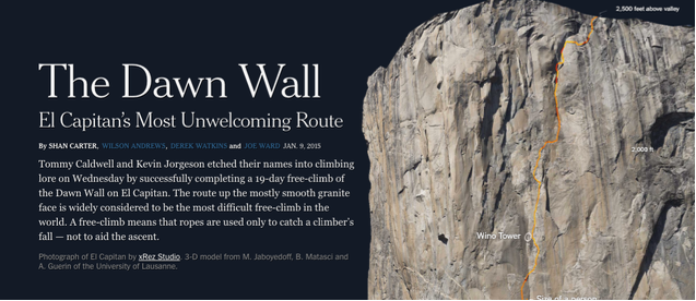
Storytelling has become one of the most influential ways of showing data on steps with a good rhythm. It has the advantages of showing the viewer pieces of information by steps, where you guide the user through the trip using different techniques to show data like texts, animations, sounds, etc. This also adds a plus, as the user can control that trip, so it gives very dynamic and positive feedback which translates into a good experience that equals to easily absorb the information.
Here is a great example of it from the The New York Times about the 19-day free-climb of the Dawn Wall on El Capitan.
PUT DATA INTO CONTEXT

Data visualisations can heavily improve the attention to the topic we are talking about by enhancing its background. That’s why The Weather Channel created on 2018 this awesome video using a 3D modelled environment around a Chroma-Key with a narrator to show ‘What does 9 feet storm surge look like?’. That is a magnificent example of how to create visualisations that can be merged with real images and interacted by humans. There is a lot of visual information that the observer gets just watching the tiny details of this amazing work.
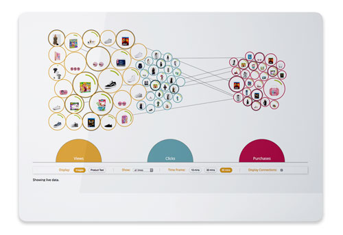
What is more, adding real images can improve the understanding of key metrics and its performance. At empathy.co, we designed the Product Performance visualisation with real product images. This way of visualising the real catalogue allows retailers to easily discern the performance of real products in terms of views and ‘add to cart’ actions.
Before reading this post you probably thought that data visualisations integrating pictures or real-life images were costly and time-consuming to produce on your own, but you have seen that just with a bit of creativity we can change the significance of a bored visualisation and made it more appealing and enjoyable.
Data visualisations are much more than bars, charts or segments, there is a huge kind of possibilities out of the box that can be explored to make from it a unique piece where each small detail counts, making each visual aspect a bit of relevant information.

