Popular Next Queries
Popular Next Queries
Towards a conversational Search

As designers of digital experiences, we live every day in the dichotomy between our hunger for intuitive, fulfilling spaces and our very human desire to protect our privacy.
So how do we find the right balance? How do we design an experience that guides people to achieve their goals whilst being honest about our use of personal data?
Human connections become search results
Simply put, Search is a dialogue based on peoples’ needs, wants and inspirations, and an estimation on how best to fulfil these desires. It is from this starting point that our Next Queries feature emerged. A collection of queries automatically generated from previous search activity, collaborative filtering and machine learning processes.
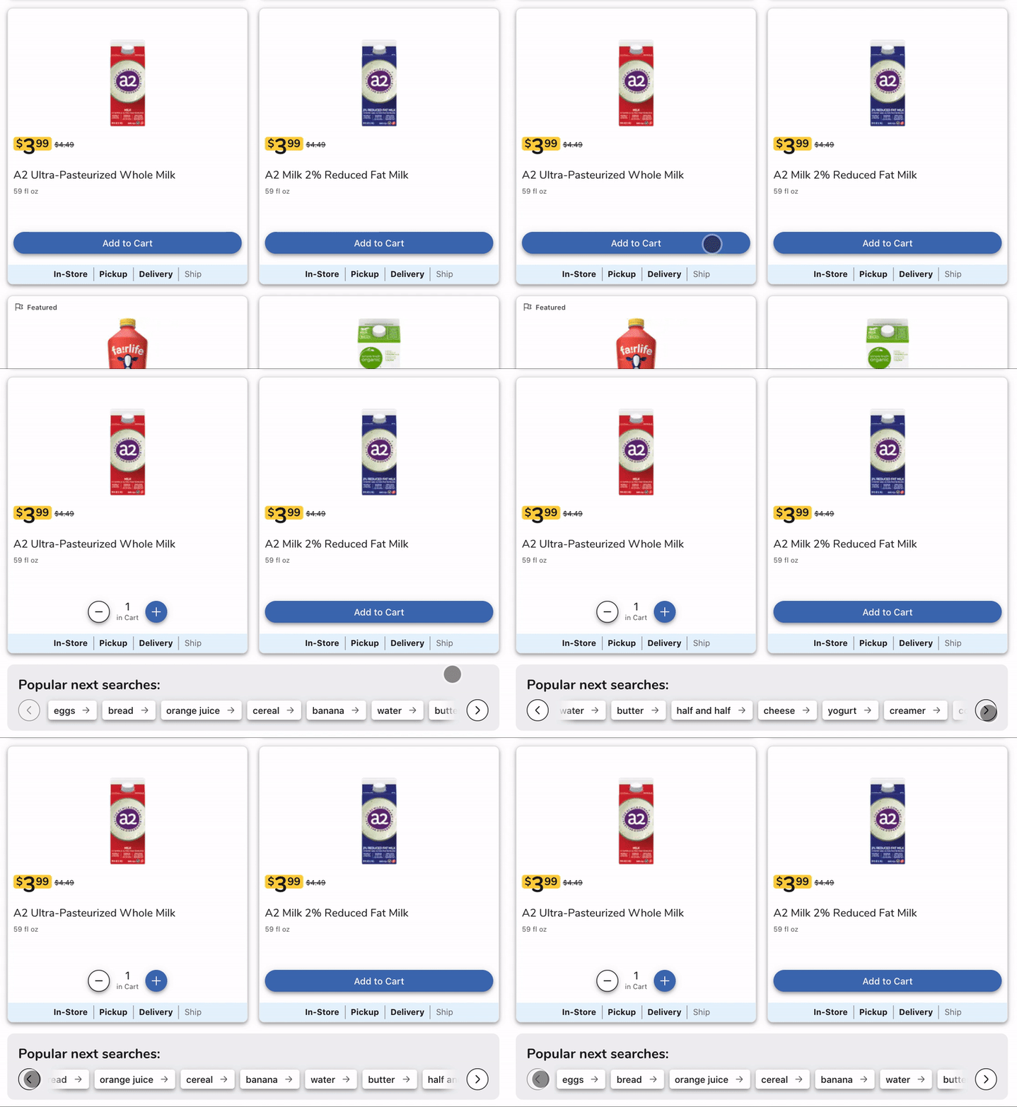
Next Queries (also known as Popular Next Searches or What’s Next?) can be found within the results page after a search has been executed in an online shop or once an item has been added to the cart to offer customers a set of next steps on their shopping journey.

Working towards the most efficient, typeless Search experience, we knew we also had to ensure no shopper privacy invasion whatsoever. And here is where our journey as UX designers begins.
Decisions, decisions
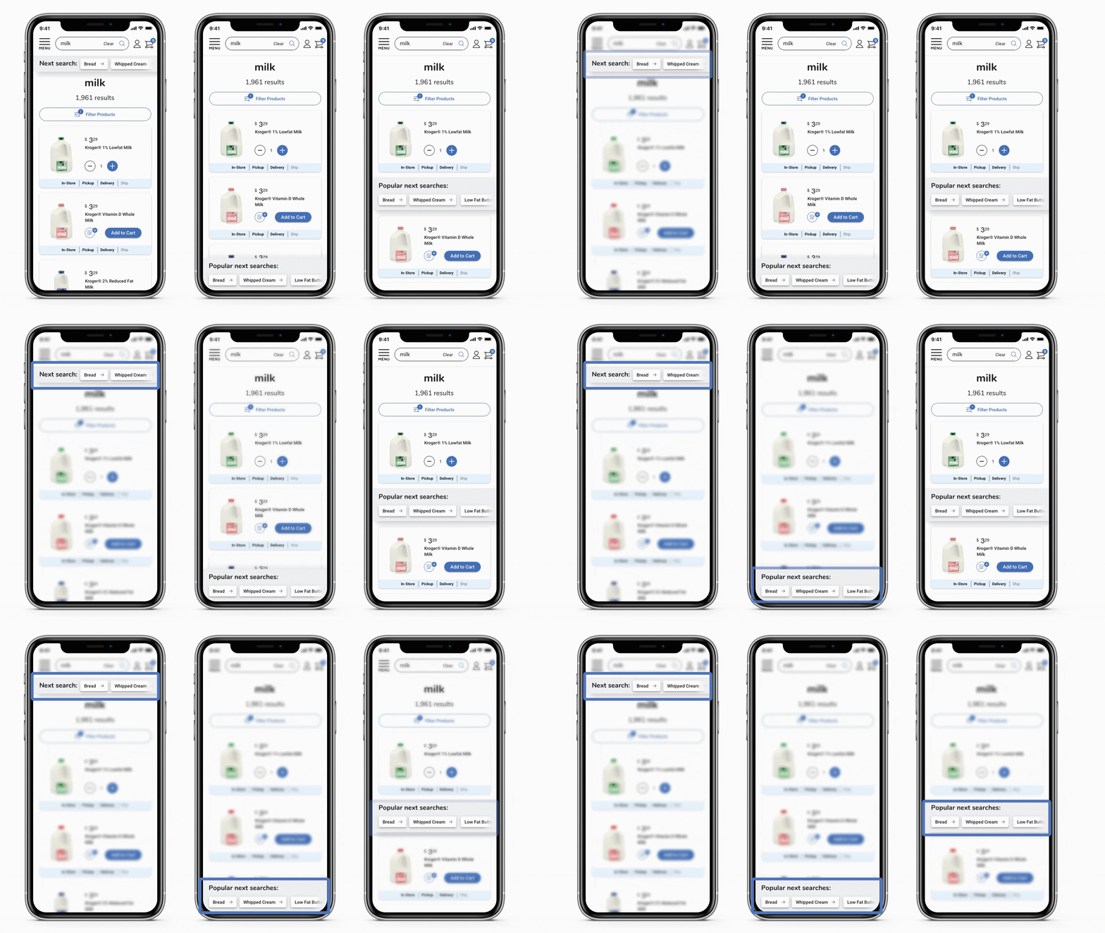
The concept for Next Queries was clear, but the most convenient position on the page was yet to be discovered. We considered three options:
1 - Under the search box:
Since the search box is at the heart of every search, and this feature is the next step in this process, this option was an obvious first choice.
2 - At the bottom of the page:
The cleanliness that this would allow would reduce interference with other page elements, making it well worth exploring.
3 - Within the results grid:
This is where the customer’s eyes are focused immediately after adding an item to the cart, and as a consequence, feels like a natural place to consider.

It was time for some user testing. Ten 1:1 moderated interviews were run, with online shoppers ranging between 25 and 65 years old and from various incomes and locations: Next Queries must be understandable and usable for all types of customers under any circumstances.
The votes are in.
Customers loved the Next Queries carousel, rating it 4.5/5.0. Its functionality was perfectly understood, and it was found extremely helpful in their pursuit for a faster and easier online shopping experience.
User tests proved that the Next Queries carousel had to be prominent to contribute to the flow of the customer journey, so we discarded the placement at the bottom of the screen. Participants were torn between the other two options, so we decided to explore both possibilities a bit further and find a way to bring the best out of each of them.
Why choose when you can have it all?
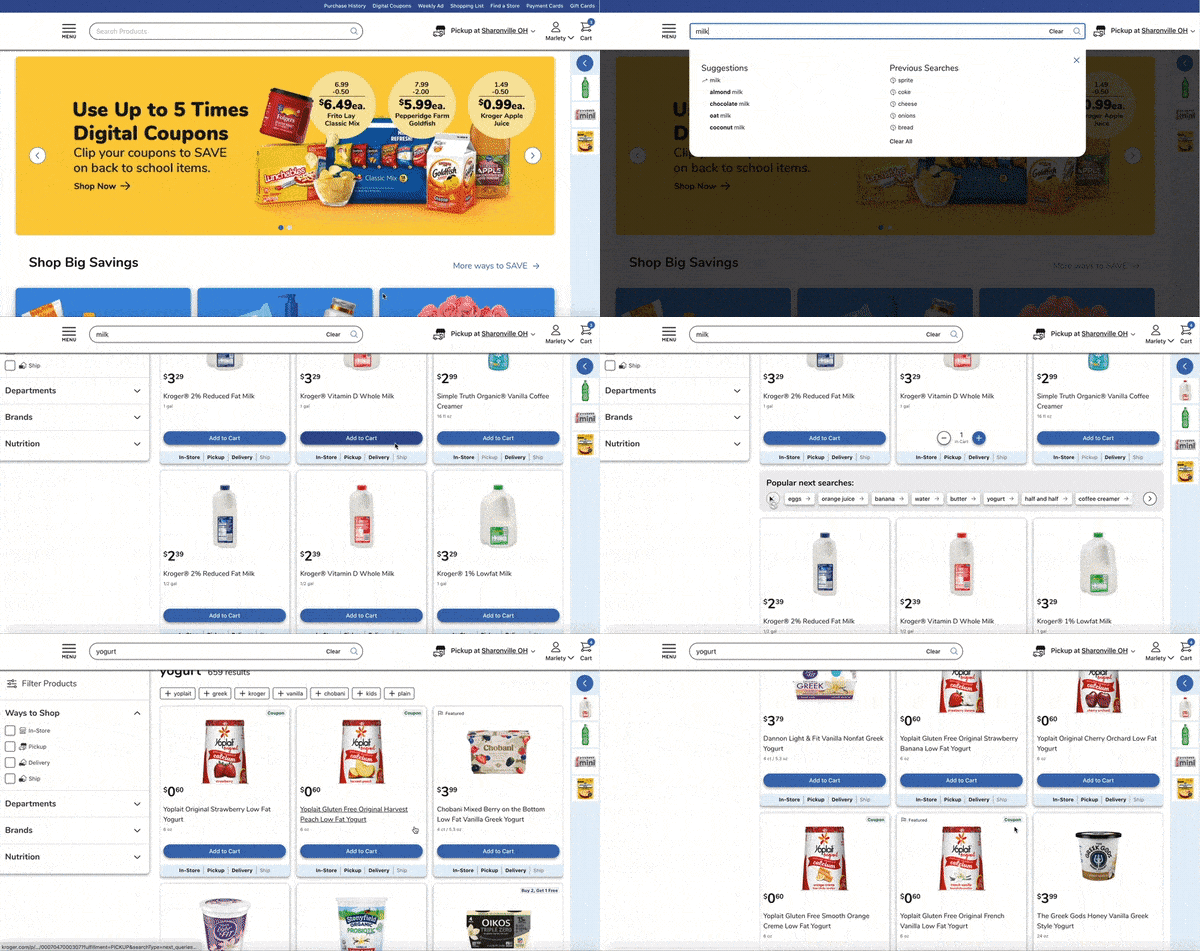
Since a significant percentage of our interactions during a search is within the search box, placing Next Queries next to it was a strong bet. But, during the user tests, most participants took longer to spot them here than after adding to cart. So, if both placements had their strengths, why not offer both in a different way?
By adapting both ideas to live together, they contribute to the customer journey in different ways. Next Queries are offered to the user right under a product that’s been added to the cart as a next step suggestion.
Whereas “What’s next?” suggestions are revealed under the search box when users begin their next search.

The results
The Next Queries carousel achieves a better experience for shoppers, made evident when our user tests revealed greater findability and more effective searches.
Shoppers who used this feature:
- Ran 3 times more searches per visit
- Spent twice as long on the site
- Experienced a 20% increase in findability on the first page of results.*
*Data collected during May and June 2021.
Trust, understanding and joy
As humans, we all love interaction, conversation and understanding. We are always striving to design a shopping experience that is efficient, transparent, and a joy to use. On our road to building Next Queries, we’ve connected to customers by listening, understanding, and resolving their needs. With this new feature, I believe we’ve succeeded in bringing an empathetic and efficient Search experience to shoppers whilst keeping their privacy and personal data safe.


