How Progressive Discovery Transforms the Search Experience
How Progressive Discovery Transforms the Search Experience
When designing user interfaces, we should take into account different factors and feelings involved. Users’ iterations, transformed into meaningful relations, can consolidate the user’s brand loyalty and awareness through an excellent, and emotional, user experience.
That’s why, in every good design process, we should put the user first and strengthen the user’s progressive discovery process. As the possibilities offered in online stores and services increase exponentially, guiding the user to decide the next steps and to control their own discovery journey is sometimes complex, as the number of different paths and interactions can be overwhelming.
For this purpose, at the beginning of the design process, we should not focus exclusively on the brand values and the interface scope, but we should take into consideration users’ motivations and concerns at any given time and prioritize the main key options that fulfil users’ needs by understanding, in an organized way, the tools our interfaces offer to control the experience.
USER’S CONTEXT
By analyzing collective behavior and patterns associated with each query, we can determine the perfect set of relevant results and interface options to be provided depending on the Context.
That’s how the user interface (UI) may be nourished to guide users through different options based on general search patterns and the user’s search history or preferences, showing what’s relevant, and placing in a secondary level what’s not.
Every single query, click and purchase from each visitor generates a signal or input that the UI should resolve into actionable intent insights. That’s the way to build highly relevant and unique results for each user, contributing to a most dynamic and intuitive digital experience.
Additionally, we can limit the number of interactions to focus the user on what’s really important in terms of context and goals.
PROGRESSIVE DISCOVERY
Instead of bombarding users with all our interface options and possibilities, we may focus on unique users’ intentions, so that we gradually show the right path to follow and the right way to narrow down the UI experience with simpler, yet effective, interfaces showing what really matters to the user.
Giving a concrete answer to something that is hidden among an extensive catalogue with a wide variety of categories, can be a progressive and intuitive journey where the user’s interactions determine what has to be offered. What’s more, apart from being progressive and intuitive, it should also be playable and entertaining.
How Super Mario shows you how to play the game is a fine example in terms of progressive learning. By limiting the options of the user, the interface forces you to interact in a logical and inevitable way – so the player quickly learns, in less than a minute, that he only can walk to the right, that hitting question marks gives power-ups, how to identify enemies and how to get rid of them. And, as a bonus, while the user learns the mechanics, the environment gets richer and more rewarding, leading pushing the player to find out what’s next.
As in Mario’s game, a site discovery journey progresses from a quite standard interface similar to competitors, with the usual elements and functionalities; in this first step, we do not try to reinvent the wheel, just provide a familiar space to the user.
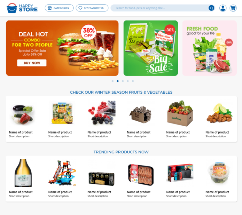
As the user starts to interact – for example, through the search box – the response is adapted to give different solutions depending on the context.
Different contexts lead to different results anticipating the needs of the user.
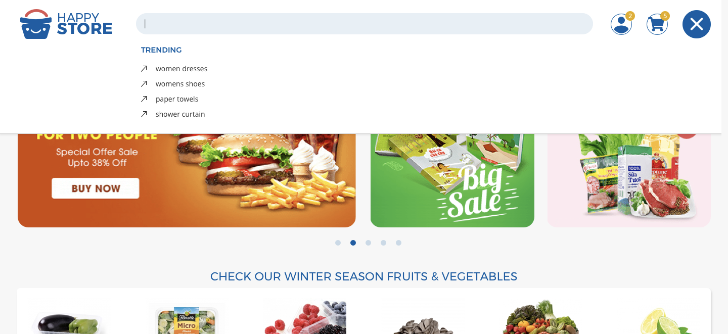
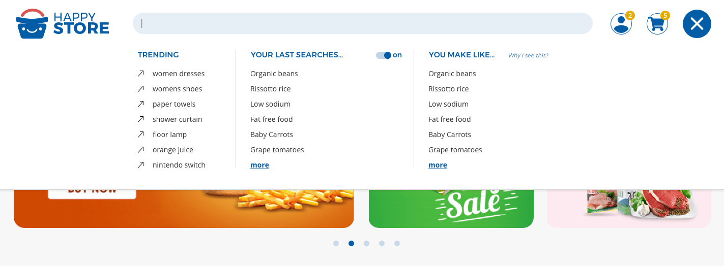

The main objective is to include the KISS (keep it simple stupid) principle and, at the same time, reward and teach the user in more complex interactions.
From a simple query and previous interactions from other users, we can also anticipate additional information and provide shortcuts to what the user really has in mind, adding interaction patterns progressively.

For example, from a results page, when a user adds a product in the cart, we can guide the user to cheaper/healthier/past purchases to help them in making instant, better and more informed decisions.
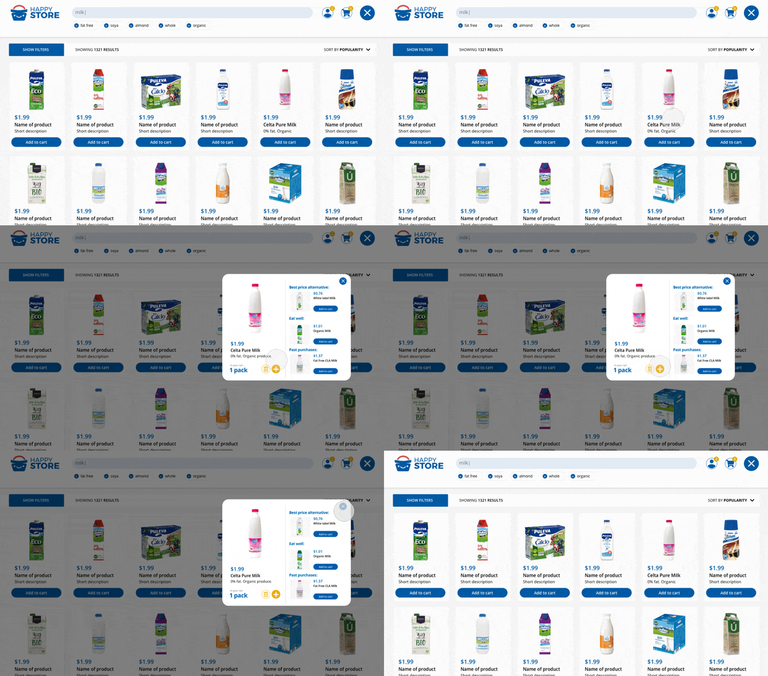
The most important thing is that the user needs to understand what is on screen any given time, and we must provide clear interactive elements with which the user may interact in an organized and consistent manner.
The main goal on a SERP page is to interact with the catalogue. But expert users may rely on filters to narrow the results to more specific elements. To do so, a filter option with a clear Call To Action button is prominently displayed in the same place alongside the site navigation tools.
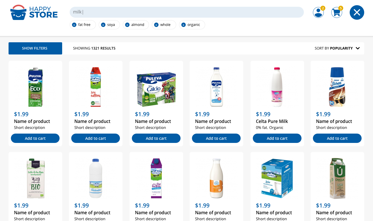
Using the context of the user, previous interactions and info from other people in the same situation is the base from which to create micro-interactions that unobtrusively help the user in each step to make the best-informed decisions.
An easy and rewarding site must be as frictionless as possible because that approach leads to satisfied visitors.
Let’s not underestimate our users; let’s give them the right options, just enough but not overwhelming, to pass through a well-informed Search & Discovery journey that translates their inputs and insights into meaningful relations with the interface. That is, offering to create an emotional bond between the people and the brand.


