Empathy’s Journey, from Sketch to Figma
Empathy’s Journey, from Sketch to Figma
Our relationship to Sketch has been long-term, and while it covered our UI development needs in the past, we have grown a lot as a company alongside the UX/UI team and our concurrent projects, so our needs have evolved.
Don’t get me wrong; we still love Sketch; it’s a great tool, but we needed to solve some issues.
Why change?
We’ve had to use complementary apps and tools to create the deliverables involved in a project or prototype. In small/medium-sized teams, this is manageable but, as aforementioned, we have seen a lot of growth in the past two years.
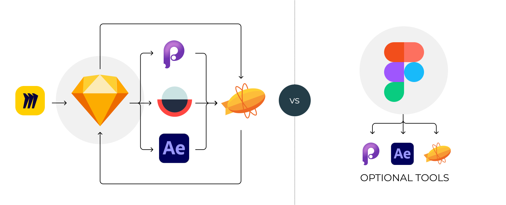
Before Figma, we had the following tools that we used to shape all kinds of deliverables:
- Sketch - for interface design and some illustrations & icons.
- Principle - to create interactive prototypes and sample animations of interfaces.
- After Effects - to solve some complex UX interactions that cannot be solved with Principle.
- Zeplin - for hand-off to frontend developers.
- Miro - in the discovery and research phases.
- Miscellaneous apps - Rotato 3D, Adobe CS, overflow.

Sketch ecosystem vs Figma
And while using all these tools helped us to achieve our goals, the truth is that there were some signs that they weren’t the optimal solution for our new needs.
We also found that having multiple tools to work with ended up hurting the experience with some inconsistencies in the deliverables and ‘breaking’ the flow of the creative process as we had to jump from one app to another to solve different aspects like design, prototype & animate.
We also determined that a big design team like ours needs more than tools to deliver, but also a clear common ground -a design process- and to constantly improve the feedback and communication tools between everyone involved in the creative process.
As 2021 passed, we entertained the idea to find a solution. And it was Figma.
Why Figma
Figma was our first alternative thanks to its promise of a space to design, prototype, animate, and work together in shared files with feedback sessions and tools. It seemed too good to be true, but after testing it with real-world projects, we believe that it delivers, there are some caveats, but there are some key characteristics that make our daily work more straightforward:
- It’s universal: We all work with shiny MacBooks in our company, but some of our clients don’t, so having a multiplatform tool that simultaneously has a competent web-based version is great.
- Everything is in one space: Discovery boards, wireframes, flows, UI designs, interactive prototypes… everything is available from the moment a new teammate joins us.
- Multiple people working on the same file: Though Sketch has recently included this, we genuinely believe that the cross-platform (web-based means universal) sets Figma apart and eases delivery and feedback processes with external collaborators.
- Prototyping and animations: There is no need to create Principle animations or prototypes or cumbersome documentation to explain how simple interface elements or transitions behave. Although some animations that depend on timeline-based events still require Principle or After effects most -if not all- the effects in a regular project can be solved easily in Figma.
- Feedback: Figma has a very robust feedback system; and, at the same time, makes it easy to share elements by directly linking or embedding in other platforms like Jira, Confluence or old-school emails.
The need for a design system
The main reason for having a design system is that we need a single source of truth for designers and developers, where anyone can find all the necessary styles and components to build a new screen for the product.
But that’s only the starting point.
We also needed it to be flexible enough to create multi-tiered designs for any brand or company and, at the same time, in sync with our internal projects, products, and UX/UI experiments.

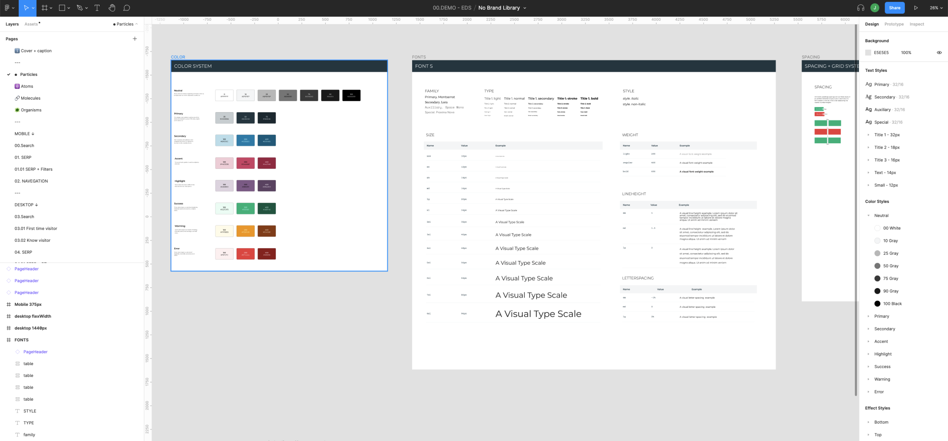
Sample documentation within Figma files
The design system must be alive, as we will constantly be adding new styles and components to it or updating older ones. All this has to be under control, with versioning and continuous feedback, minimising the need to use alternate tools so we can streamline our way of working.
And all of this while being in sync with the developers -naming conventions, components, etc.- so we started the journey to create our empathy design system or EDS.
The EDS
We decided to use the ‘Atomic Design’ method from Brad Frost. All components in a design system are distributed and combined at different levels of increasing complexity (atoms, molecules, organisms, and templates). Hence, molecules are combinations of atoms; the organism may be a combination of atoms and molecules.
In terms of what each level is, the consensus is that:
- Atoms: They are the foundations and basic building blocks of ‘matter’, so they are, in terms of interfaces/design, type, colours, borders, shadows, spacings, etc.
- Molecules: They are atoms pieced together to complete basic functions. For example, a checklist item comprises a checkbox and a text.
- Organisms: They are groups of molecules that allow us to create complex features. For example, an onboarding card with text, illustration, action button, closing icon, etc.
- Templates: They are the final page or screen composed of any organisms/molecules needed to include the features required for any interface touchpoint with the user.

Brad Frost’s Atomic Design method plus particles
But this, as it is ideal for standalone projects, we needed an additional layer to increase flexibility. A layer that connected with our developers and, at the same time, had no impact on the creative project.
We call it particles, and they implement our API frontend tokens, so all teams are in sync and speak the same language.
The migration
Well, this is currently a work in progress. We already have hundreds of projects in Sketch, and we are adapting them to Figma as some details (auto layouts, symbols, etc.) are different between apps. Still, we have been positively surprised about how almost flawlessly Figma imports and adapts sketch files without breaking anything.
We have a wide range of projects, and some of them have to be 100% EDS-based, and some of them include custom styles or branding elements that require some flexibility. How do we achieve this?
- Fully EDS compliant: These are empathy branded products, projects, or future features demos. It is the core starting point for the rest of the projects with a robust and comprehensive set of molecules, organisms, and templates for rapid adaptation and creation of custom user flows, user tests, etc.
- Future features: We are continuously experimenting with new features. Once these features are validated through user testing, they are included in the core EDS and available for any new project.
- Branded projects: Partially customised look&feel projects where our particles/atoms/molecules are adapted to reflect the branding. We keep our naming schemas and, if needed, adapt organisms and templates based on the rules defined by the particle/atom/molecules elements.
-
Custom projects: Projects that have strong brand values that may not fit entirely in our own EDS system. They require adapting our core elements, but, if possible, we keep the foundations (naming, particles, atoms) as they are to maintain consistency.

Keeping consistency across all deliverables & projects
What’s next
This is a short introduction to a process. It’s still a work in progress. So we’ll keep sharing our experience with this migration and how:
- Figma can become the connecting tissue between the different stages (research, discovery, design, prototype, etc.) of any project.
- We overcame Figma animation limitations to deliver rich prototypes to explain features and use cases.
- Developers and stakeholders became an integral part of creating richer experiences as they are part of the design process from the very beginning.
In the end, the main reason behind this process is that as we grew and faced more complex projects simultaneously and communication across all teams was key to success. We found out that this was the way to go, primarily because of how easy it makes to work with people remotely.


